How tall does booth text need to be?
The ADA Standards set minimum character heights for signs in buildings, not for exhibition graphics, but the arithmetic is the most defensible legibility floor available. Chapter 7 of the Access Board guide explains that visual characters must be at least 5/8 inch tall for viewing distances up to 6 feet, plus 1/8 inch for each additional foot, and that characters must contrast with their background and avoid glare.
Applied to a hall, that gives a simple table.
| Read from | Minimum capital height | Realistic word count |
|---|---|---|
| 6 feet | 5/8 inch | A short sentence |
| 10 feet | About 1 1/8 inch | Five to seven words |
| 15 feet | About 1 3/4 inch | Three to five words |
| 25 feet | About 3 inches | Two or three words |
| 40 feet | About 5 inches | Your name and category |
Treat those as minimums for people with good eyesight in good light. Exhibition halls have mixed lighting, moving crowds and competing color, so going one size larger is rarely wasted.
What belongs in each zone?
Work from the far distance inward, because the far distance decides whether anyone walks over at all.
The hall zone, above about 7 feet, carries your name and the category you are in. Nothing else. If a stranger 40 feet away cannot tell within two seconds what kind of company you are, the rest of the booth never gets read.
The aisle zone, roughly 3 to 7 feet off the floor, carries the reason to stop: one offer, one proof point or one question. This is where a roll up banner earns its place, because you can swap it per show without touching the wall.
The counter zone, below about 3 feet and within reach, carries detail: specifications, prices, a code to scan, a handout. Text here can be 10 to 12 point because people are holding it.
Why does the bottom third of the wall disappear?
Because bodies are in front of it. A standing visitor blocks roughly from the floor to 5 or 6 feet at close range, and two staff members block more. Anything printed below about 30 inches on a back wall will be seen only when the booth is empty, which is not the state you are optimizing for.
The practical rule is to keep the lower third of a back wall as texture, color or product photography, and put no words there that matter. Put those words on a counter graphic or a banner at the front instead.
How do you check sightlines before the show?
Test at full size in a corridor, not on a screen. Print the headline at the intended height on plain paper, tape it at the height it will sit, then walk backwards.
- Stand at 40 feet and note what you can identify without squinting.
- Stand at 15 feet and count how many words you can read while walking past at normal speed.
- Hold the handout at arm's length and check the smallest text.
- Repeat with the lights dimmed, since hall lighting is uneven.
- Ask someone who does not know the copy to report what they saw.
If a phrase only works when you stop and stare, it belongs in the counter zone.
Does contrast matter as much as size?
Yes, and it is cheaper to fix. The Access Board guidance pairs character height with a requirement that characters contrast with their background and that the finish be non glare. In a hall lit from above, a glossy dark wall with mid tone text becomes a mirror.
Prefer high contrast pairs: near black on near white, white on a deep saturated color, or a single strong brand color on white. Avoid thin light weights of type at large sizes, tinted photographs behind headlines and gradients that pass through the same value as the text. Fabric walls scatter light rather than reflecting it, which is one practical reason they read better than glossy vinyl at long distances.
What about type that has to compete sideways?
In a linear booth you are read at an angle more often than head on, because people approach along the aisle. Text that sits flat against the back wall is compressed from the side, so headlines near the edges of the wall lose width.
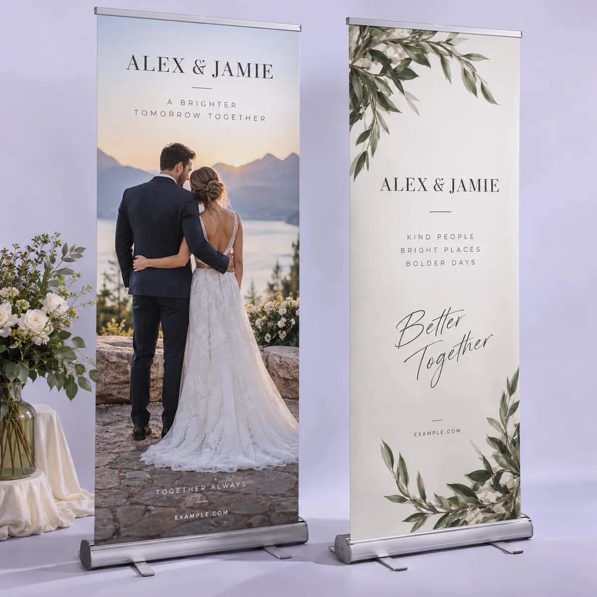
Centre the critical words, or repeat them on a piece that faces down the aisle, such as a feather flag or a tall banner at the front corner. Double sided pieces are worth the extra cost in aisles with two way traffic.
What is the sightline checklist?
- Write your name and category in the hall zone, above 7 feet, in the largest type on the stand.
- Give the aisle zone one offer in three to seven words.
- Keep detail in the counter zone, within reach.
- Assume the bottom third of the back wall is blocked all day.
- Use the ADA table to set minimum capital height per distance, then add a size.
- Choose high contrast pairings and non glare surfaces.
- Print the headline at full size and walk it back before approving.
Frequently asked questions
How big should the text on a trade show banner be?
Set it from the reading distance. Using the ADA benchmark for visual characters, a headline read from 15 feet needs capital letters close to 1 3/4 inch, and one read from 25 feet closer to 3 inches. Exhibition halls are noisy visually, so treat those as minimums and go one size larger when the layout allows.
How many words should a booth back wall have?
At 40 feet, your name and the category you work in, and nothing more. Save the offer for a banner in the aisle zone and the detail for a counter graphic or handout. Visitors read a back wall while walking, so anything longer than a short phrase is simply not read.
Why does my booth graphic look worse in the hall than in the proof?
Three reasons: distance, overhead lighting and people. A screen proof is viewed at arm's length in even light, while the real graphic is read from 15 feet under directional lights with visitors standing in front of it. Test the headline at full printed size in a corridor before approving the file.
Is fabric or vinyl better for readability?
Fabric scatters light and shows less glare, which usually helps text read from a distance under hall lighting. Vinyl gives punchier color and is more durable outdoors. If your booth is indoors and text heavy, the lower glare of fabric is normally the safer choice.
Sources & specification notes
The references below support the relevant technical or product details in this guide. Examples and checklists are not claims of practical testing or universal supplier requirements. Confirm the current specifications for your chosen product before production.
- U.S. Access Board: Guide to the ADA Standards, chapter 7 signs ↗
Visual characters need 5/8 inch minimum height plus 1/8 inch per foot of viewing distance beyond 6 feet, must contrast with their background and must have a non glare finish.
- W3C: Understanding WCAG 2.2 success criterion 1.4.3, contrast minimum ↗
Used as a contrast reference: 4.5 to 1 for normal text and 3 to 1 for large text.