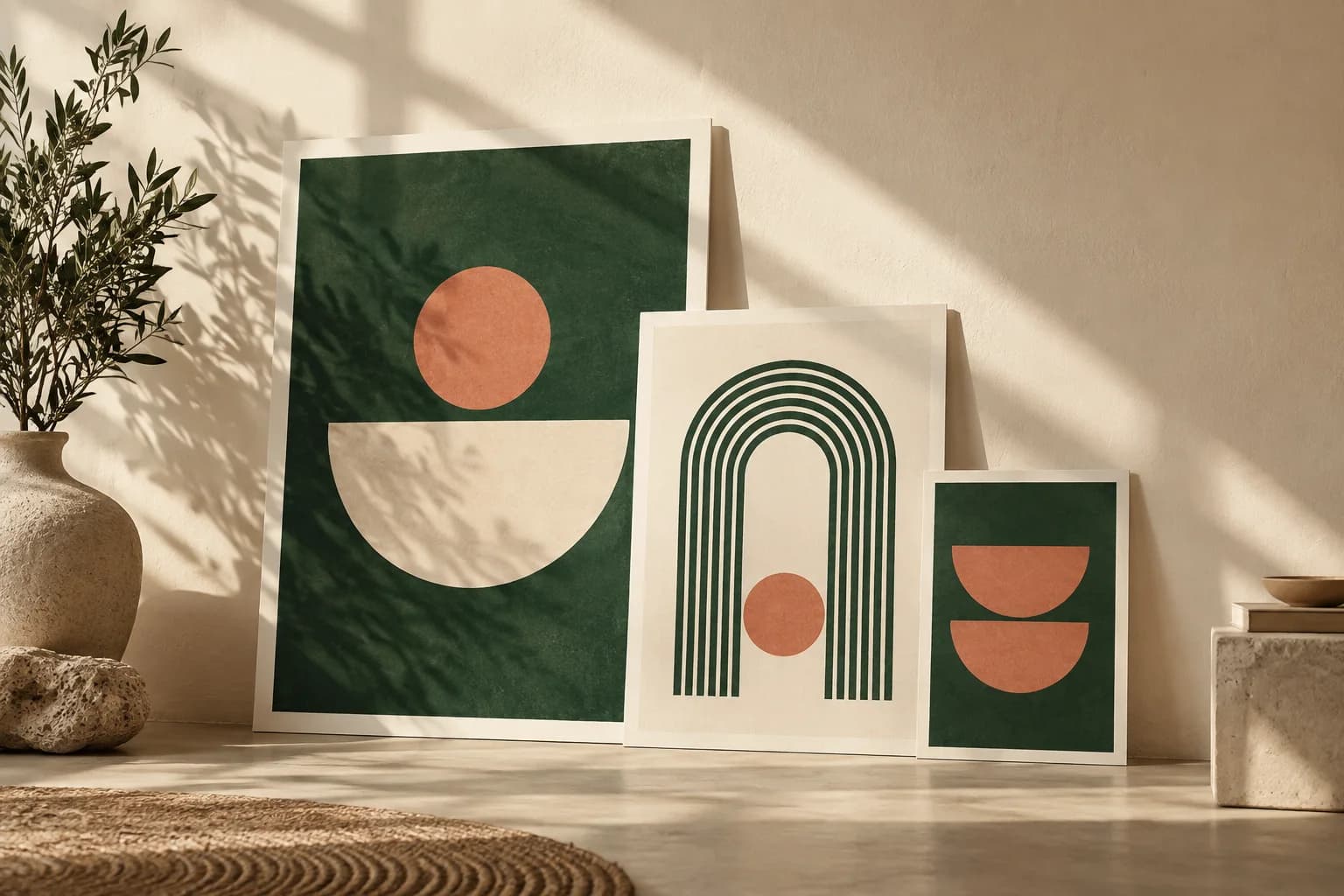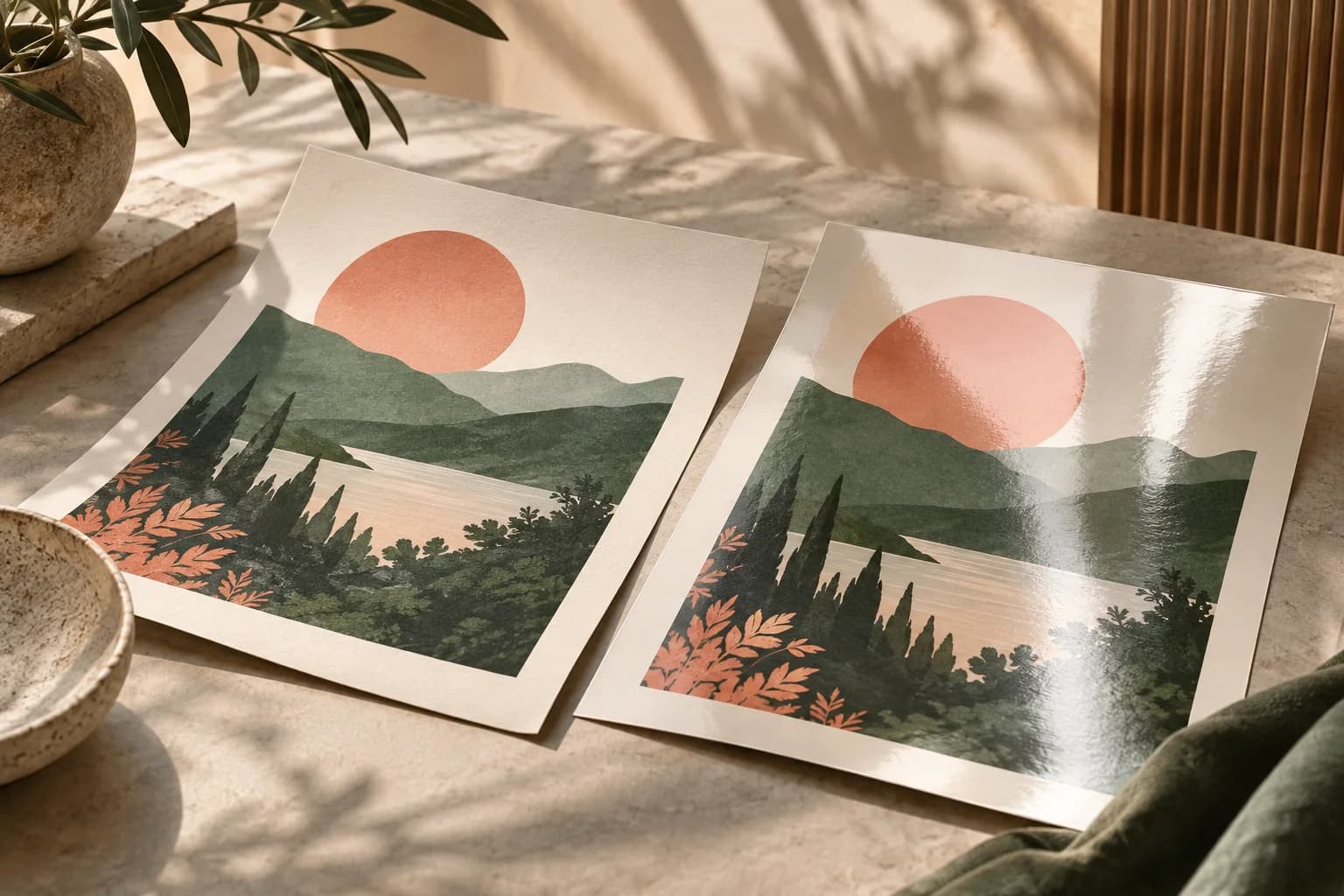
What is the difference between 11x17 and 18x24 posters?
Beyond area, the two sizes have different shapes. An 11 x 17 sheet has a ratio of about 1.55 to 1, close to a tall letter page. An 18 x 24 poster is 3:4, which is noticeably wider for its height. That matters because a layout made for one does not simply scale to the other.
| Spec | 11 x 17 | 18 x 24 |
|---|---|---|
| Area | 187 sq in | 432 sq in |
| Aspect ratio | about 1.55 to 1 | 1.33 to 1 (3:4) |
| Metric size | 279.4 x 431.8 mm | 457.2 x 609.6 mm |
| Pixels at 150 PPI | 1,650 x 2,550 | 2,700 x 3,600 |
| Pixels at 300 PPI | 3,300 x 5,100 | 5,400 x 7,200 |
| Typical placement | Counters, boards, doors | Walls, windows, hallways |
For every standard size side by side, see the full guide to poster sizes.
Which size is easier to read from a distance?
Size the poster for the distance of the person you want to reach. The U.S. Access Board guidance for ADA signs gives a useful benchmark: visual characters mounted 40 to 70 inches above the floor need a minimum height of 5/8 inch for viewing under 6 feet, plus 1/8 inch for every foot beyond 6 feet. Promotional posters are not bound by that rule, but it shows how fast the minimum grows.
| Viewing distance | Minimum character height | Fits comfortably on |
|---|---|---|
| Under 6 ft | 5/8 in | Either size |
| 10 ft | 1 1/8 in | Either size, 18 x 24 gives more room |
| 15 ft | 1 3/4 in | 18 x 24 |
| 20 ft | 2 3/8 in | 18 x 24, with a short headline |
Those are minimums for key words. Headlines should be several times larger, and an 11 x 17 poster runs out of width quickly when a headline needs 3 inch letters. The poster font size guide gives sizes for headlines, details and fine print.
Contrast matters as much as size. The W3C contrast guidance asks for a ratio of at least 4.5 to 1 for normal text and 3 to 1 for large text, a useful target for poster colors, especially on the smaller sheet where supporting text is small.
Can you scale an 11x17 design up to 18x24?
Not cleanly. Because 18 x 24 is proportionally wider, scaling an 11 x 17 layout to fill the width pushes nearly 4 inches of the height off the sheet, and scaling to fit the height leaves empty bands at the sides. Stretching the design distorts type and faces.
Plan one of three fixes: extend the background at the sides, crop part of the image at top or bottom, or rebuild the layout with a larger headline and more space. Rebuilding usually looks best, because the extra area is the reason for choosing the bigger size.
How many pixels does each size need?
Multiply the dimensions in inches by the pixels per inch you want. Use 300 PPI for posters people read up close and 150 PPI as a sensible minimum at final size for posters viewed from a few feet away. The print resolution calculator checks the effective PPI of a photo at either size. Add bleed from the template, commonly 0.125 inch per side, before setting the canvas.
A photo that looks sharp at 11 x 17 may not hold up at 18 x 24, because the same pixels stretch across 2.31 times the area. Check the image at the larger size before you commit to it.
Is 18x24 much more expensive than 11x17?
It costs more, but the area ratio is not a price multiplier. Paper, press setup, finishing and quantity all shape the quote, so compare both sizes with the same stock, lamination and quantity. Custom posters start at $4.99 for one print, and the product page shows current sizes and paper options.
Include the cost of hanging. A larger poster may need a bigger frame, rail or clear wall area. Frames for 18 x 24 are widely available, while 11 x 17 often goes in a clip frame or straight onto a notice board.
When should you pick 11x17?
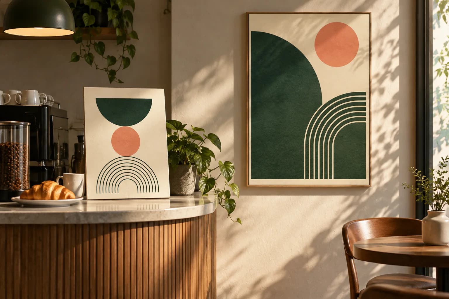
Choose 11 x 17 when people stand close, when space is limited, or when you need many copies across many locations. It works on cafe counters, community boards, classroom doors, break rooms and event tables. It also fits standard notice board space without covering other notices. Because many office printers handle 11 x 17 paper, it is also easy to print a quick draft at full size and check the layout on the wall before ordering.
When should you pick 18x24?
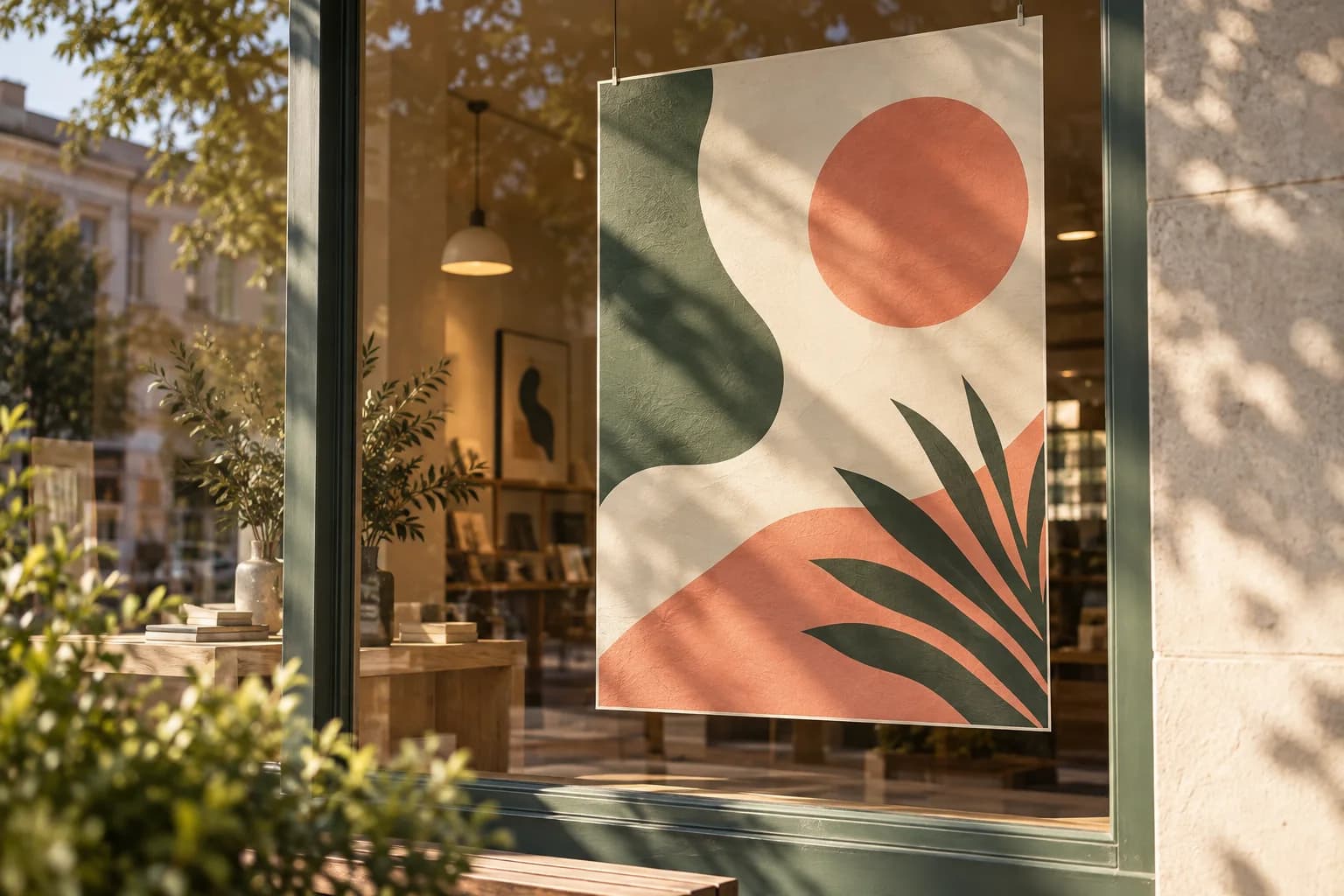
Choose 18 x 24 when the poster must hold a wall on its own or be read from across a room. It suits storefront windows, office corridors, lobbies, menu displays and events. For a window, the window poster printing guide covers placement and reading from the street.
Checklist before you choose
- Measure the wall, frame or clear window area.
- Measure the real viewing distance and size the headline for it.
- Rebuild the layout for the new aspect ratio instead of stretching it.
- Check the photo at 150 to 300 PPI at the chosen size.
- Compare quotes with the same paper, finish and quantity.
- Include frames or mounting in the budget.
Frequently asked questions
How much bigger is an 18x24 poster than an 11x17?
An 18 x 24 poster has 432 square inches of area and an 11 x 17 poster has 187, so the larger size is about 2.31 times bigger. It is also proportionally wider: 18 x 24 has a 3:4 ratio, while 11 x 17 is about 1.55 to 1. That difference is why a design needs rework to move between the sizes.
Is 11x17 a good poster size?
Yes, for close viewing. An 11 x 17 poster suits counters, notice boards, doors, break rooms and event tables, where people read from a few feet away. It is also practical when you need many copies across many locations. For a wall that must be read from across a room, a larger size such as 18 x 24 works better.
What resolution do I need for an 18x24 poster?
For sharp results up close, aim for 5,400 x 7,200 pixels, which is 300 pixels per inch at 18 x 24. For a poster viewed from a few feet away, 2,700 x 3,600 pixels, or 150 PPI, is a sensible minimum. Add the bleed from your template, and remember that raising the PPI setting alone does not add detail.
Can I print an 11x17 design at 18x24?
You can, but not by simply enlarging it. The sizes have different shapes, so scaling an 11 x 17 layout to 18 x 24 either cuts off nearly 4 inches of height or leaves empty space at the sides. Extend the background, crop the image or rebuild the layout, and check the photo resolution at the larger size.
Sources & specification notes
The references below support the relevant technical or product details in this guide. Examples and checklists are not claims of practical testing or universal supplier requirements. Confirm the current specifications for your chosen product before production.
- U.S. Access Board: Guide to the ADA Standards, chapter 7 signs ↗
Visual characters need 5/8 inch minimum height plus 1/8 inch per foot of viewing distance beyond 6 feet, and visual characters must contrast with their background and have a finish without glare.
- W3C: Understanding WCAG 2.2 success criterion 1.4.3, contrast minimum ↗
Text needs a contrast ratio of at least 4.5 to 1, or 3 to 1 for large text of 18 point, or 14 point bold.