The three zones on the front
Think of the front of an envelope as three reserved zones and one design area.
| Zone | Position | Contents |
|---|---|---|
| Postage | Top right corner | Stamp, meter mark or permit imprint |
| Return address | Top left corner | Your name and address, compact |
| Delivery address | Center, parallel to longest edge | Recipient address block only |
| Design area | Left and lower areas, back flap | Logo, color, pattern, teaser copy |
The delivery address block should read horizontally along the long dimension of the envelope. A vertical or angled address is one of the listed reasons a letter becomes nonmachinable, which means it leaves the automated stream and costs more to handle.
Keep the delivery address zone clean. Anything printed near it, including a pale watermark or a brand rule, is noise for a scanner. Put the design where the design belongs and leave the address alone.
Formatting the address block
The postal addressing standards set the format for delivery addresses, and the useful summary for anyone designing stationery is this: the address is a short stack of lines, read bottom up by the machinery, with the most general information last.
- Recipient name on the first line.
- Secondary information such as a suite, apartment or unit on its own line, or appended to the street line.
- Street address on the next line.
- City, state abbreviation and ZIP code on the last line.
- Country name alone on a final line for international mail.
Use the standard two letter state abbreviation and the correct street suffix abbreviation. Set the block flush left, not centered, and keep it on one consistent left margin so every line starts at the same place. Uppercase is traditional for machine readability, and mixed case is widely accepted; what matters more is that the type is clean, unstyled and high contrast.
Do not decorate the address. Script faces, tight letter spacing, condensed type below about 8 pt and colored ink all reduce legibility for both people and equipment.
The clear space around the block
Automated equipment looks for the address in a defined area, so keep a generous margin around it. A practical working rule for a No. 10 envelope is to leave at least 0.5 in clear above, below, left and right of the block, and to keep the whole block within the middle band of the envelope height rather than drifting toward the bottom edge.
The bottom strip of an envelope matters in particular, because that is where a barcode may be applied. Keep the lower portion of the front free of artwork and dark color.
If you are designing a full bleed envelope, plan a light panel for the address rather than trusting dark ink to be readable. Print contrast between the address and its background is what the whole process depends on.
Return address, and why it belongs there
The return address in the top left corner does two jobs: it gets undeliverable mail back to you, and it identifies the sender before the envelope is opened. For business mail, that second job is often the more valuable one.
Keep it compact and quiet. Three or four short lines at 8 to 9 pt, in the same typeface as your letterhead, set flush left. A logo can sit beside it at a modest size. What it must not do is compete with the delivery address or drift toward the center of the envelope.
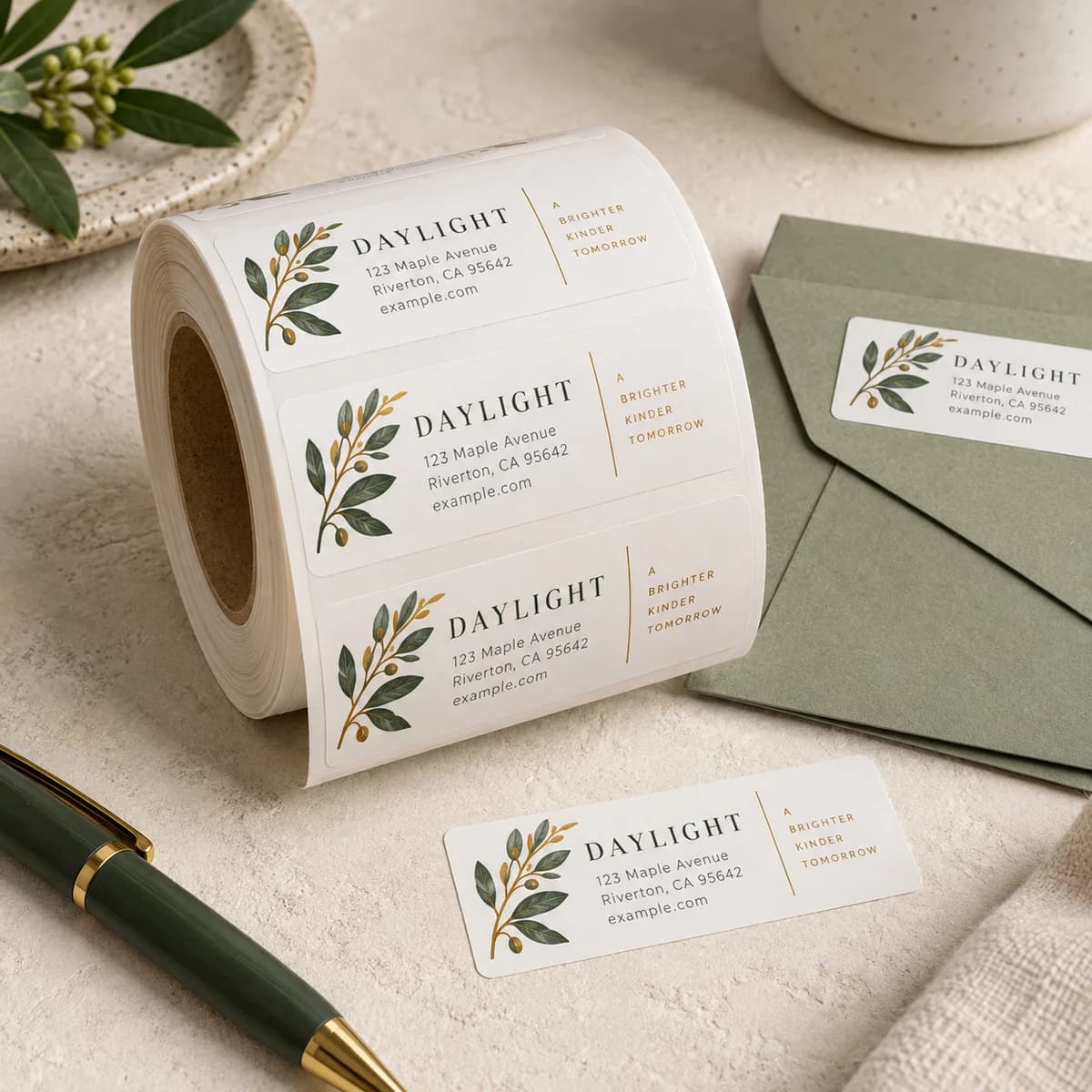
If you would rather not print a return address on every envelope, a return address label or a pre inked address stamp gives the same result on plain envelopes and lets you use one envelope stock for several purposes. The comparison of labels against stamps covers when each makes sense.
Handwriting, and when it is worth it
For invitations, thank you notes and personal correspondence, a handwritten delivery address genuinely increases the chance the envelope is opened, because it does not look like a bill. It is also the format most likely to be misread if the handwriting is poor or the ink is light.
If you hand address, use a dark ink pen with a fine tip that does not bleed on the stock, write flush left in the center zone, and keep the same structure as a printed block: name, street, then city, state and ZIP on the last line. Uncoated stock takes ink far better than coated. Test one envelope before you address 120.
A printed return address plus a handwritten delivery address is the combination that looks personal and still gets returned if it cannot be delivered.
International mail
For mail leaving the United States, the country name goes on its own final line, in capitals, in English. Keep the rest of the address in the format of the destination country, which often means the postal code comes before the city rather than after it.
Do not abbreviate the country. Do not put the country on the same line as the city. Those two errors are the most common causes of international mail taking a detour.
Address placement checklist
- Delivery address centered, reading parallel to the longest edge.
- Return address top left, compact and quiet.
- Postage area top right, kept clear.
- At least 0.5 in of clear space around the delivery block.
- Lower strip of the envelope left free of artwork for barcoding.
- Block set flush left, clean unstyled type, high contrast on light background.
- Standard state and street suffix abbreviations, ZIP code on the last line.
- Country name alone on the final line for international mail.
- Test print or hand write one envelope before doing the whole run.
Frequently asked questions
Where does the address go on an envelope?
The delivery address goes in the center of the front, reading parallel to the longest edge. The return address goes in the top left corner and the postage in the top right. Keep the center zone clear of logos, rules and background artwork.
Should the address be centered or flush left?
Set the lines flush left so every line starts at the same margin, but position that block in the center of the envelope. Flush left is easier for both people and equipment to read than centered lines of varying length.
Does the delivery address have to be horizontal?
It should read parallel to the longest edge of the envelope. An address printed vertically or at an angle is one of the listed reasons a letter is treated as nonmachinable, which takes it out of automated processing and increases handling cost.
How do I address an envelope going overseas?
Keep the address in the destination country's own format, which often places the postal code before the city, then put the country name alone on the final line in English capitals. Do not abbreviate the country and do not put it on the city line.
Sources & specification notes
The references below support the relevant technical or product details in this guide. Examples and checklists are not claims of practical testing or universal supplier requirements. Confirm the current specifications for your chosen product before production.
- USPS Postal Explorer: Publication 28, Postal Addressing Standards ↗
The authoritative format for delivery addresses, including line order, secondary unit designators, state and suffix abbreviations and international addressing.
- USPS Postal Explorer: DMM 201 Physical Standards ↗
Lists address orientation among the characteristics that make a letter size piece nonmachinable.