Why contrast is the whole question
Automated mail processing reads the delivery address optically, and it needs a strong difference between the characters and their background. USPS guidance for window envelopes makes the principle explicit by requiring the address to sit on white or very light colored paper and the window material to preserve print contrast.
The same logic applies to an address printed straight onto an envelope. Dark ink on a dark envelope may look striking in a photograph and be nearly unreadable under a scanner or in a dim hallway. That is not an aesthetic preference; it is the difference between a mailing arriving and a mailing being handled by hand or returned.
What works on each stock
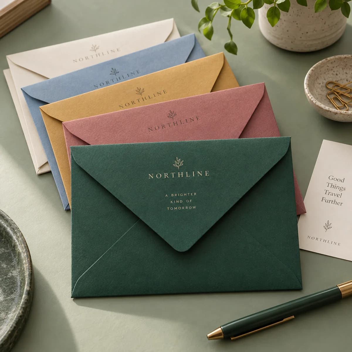
Colored envelopes here come in five options: silver metallic, navy blue, ruby red, white linen and kraft paper, in four sizes including a No. 9, with a moisture activated lick and seal flap and fade and scratch resistant color. They are not custom printed, so personalization happens with stamps, stickers or labels, which actually makes the contrast problem easy to solve.
| Stock | Address approach | Notes |
|---|---|---|
| White linen | Write or print directly | Texture can break fine pen lines; use a firmer nib |
| Kraft | Write or print directly, dark ink | Warm background; avoid brown or gray inks |
| Silver metallic | White or clear label with dark print | Metallic surfaces resist many pen inks |
| Navy blue | White label or light panel | Do not write in white pen for the delivery address |
| Ruby red | White label or light panel | Red backgrounds reduce contrast for many scanners |
A white self adhesive label with crisp dark type solves all three dark stocks at once and looks deliberate rather than apologetic, particularly on a formal suite where every envelope is identical.
White ink and metallic pens
White ink on navy is the look everyone wants, and it is the one most likely to cause trouble. A hand lettered white address on dark stock is beautiful, and it is also low contrast in the direction scanners are least good at.
If you want it, use it for a mailing where a delay or a hand sort is acceptable, and keep the number of pieces small. For anything time sensitive, high volume or commercially important, use a light panel or label for the delivery address and save the white ink for the return address and decoration, where legibility matters less.
Ink behavior on the stock is a separate test. Metallic and coated surfaces resist water based inks, which then smear rather than dry. Buy a few envelopes, write on every stock you are considering, wait ten minutes and rub a thumb across each one.
Labels, stamps and seals
Because these envelopes are not custom printed, three products do the personalizing, and they behave differently.
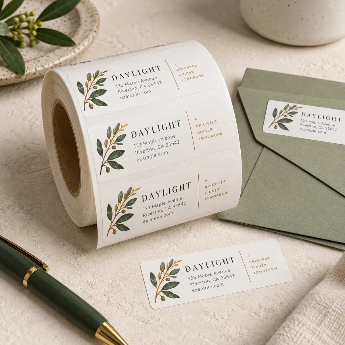
Return address labels at 2.67 x 0.83 in come in sheet or roll format on semi gloss paper, gold foil, silver foil or clear plastic. The foil and plastic options are waterproof; the paper is not. On a dark envelope, a clear label shows the envelope color through it, which means a clear label is the wrong choice for a delivery address on navy and the right choice for a subtle return address.
Pre inked address stamps give a consistent return address on plain and light stock, in black, blue or red, for up to several thousand impressions. They are excellent on kraft and linen and unreliable on metallic surfaces, where the ink does not key into the sheet.
Envelope seals at 1.5 x 1.5 in close the flap and add a mark, in white, gold foil, silver foil or plastic, with permanent adhesive. A flat sticker seal is machinable; a raised wax seal is not.
Return address and postage zones still apply
Color does not change the layout. The return address belongs top left, the postage top right, and the delivery address in the center reading parallel to the longest edge, with clear space around it and nothing printed in the lower strip where a barcode may be applied.
On a dark envelope, that lower strip matters more than usual. Keep it free of foil, pattern and heavy color so a barcode has somewhere to sit.
Matching the envelope to the insert
An envelope should be about 0.125 to 0.25 in larger than the insert in each direction, and it should be at least as substantial as what goes inside it. Colored envelopes here are sized for cards in the same range, which removes most of the guesswork.
Two pairing notes. A dark envelope with a thin white letter inside shows the shadow of the fold, so pair dark stock with a card rather than a folded sheet. And a kraft envelope tints everything printed on it, so if kraft is part of the plan, use dark, simple artwork and skip pale colors entirely.
Colored envelope checklist
- Decide the delivery address method before you choose the color.
- Print or write directly only on white linen and kraft.
- Use a white label or light panel for navy, ruby and silver metallic.
- Save white ink and metallic pens for the return address and decoration.
- Test every ink on the actual stock and rub it after ten minutes.
- Choose clear labels for subtle return addresses, not for delivery addresses on dark stock.
- Keep the lower strip of the front free for barcoding.
- Use flat sticker seals rather than raised wax if the piece must stay machinable.
- Pair dark envelopes with cards rather than folded sheets.
Frequently asked questions
Can I mail a dark colored envelope?
Yes, provided the delivery address is readable. Print or apply the address on a light surface such as a white label or a light panel rather than writing directly onto navy, ruby or metallic stock, because optical processing depends on strong contrast.
Can I use white ink on a navy envelope for the address?
It looks beautiful and it is low contrast in exactly the direction that causes problems. Use it for small, non urgent mailings where a hand sort is acceptable, and use a light panel or white label for the delivery address on anything time sensitive or high volume.
Are colored envelopes custom printed?
These are not. They come in five stock colors with a moisture activated flap, and you personalize them with return address labels, pre inked stamps or envelope seals. That also makes it straightforward to give the delivery address a light surface to sit on.
Which label material works on a dark envelope?
A white paper or white plastic label with dark type gives the contrast the address needs. A clear label lets the envelope color show through, so it suits a subtle return address on light stock but not a delivery address on dark stock.
Sources & specification notes
The references below support the relevant technical or product details in this guide. Examples and checklists are not claims of practical testing or universal supplier requirements. Confirm the current specifications for your chosen product before production.
- USPS Publication 25: Window Envelope ↗
Requires the address on white or very light colored paper and print contrast to be maintained for processing efficiency.
- USPS Postal Explorer: Publication 28, Postal Addressing Standards ↗
Standard delivery address format and components, used here for what the address block must contain and how it is set.