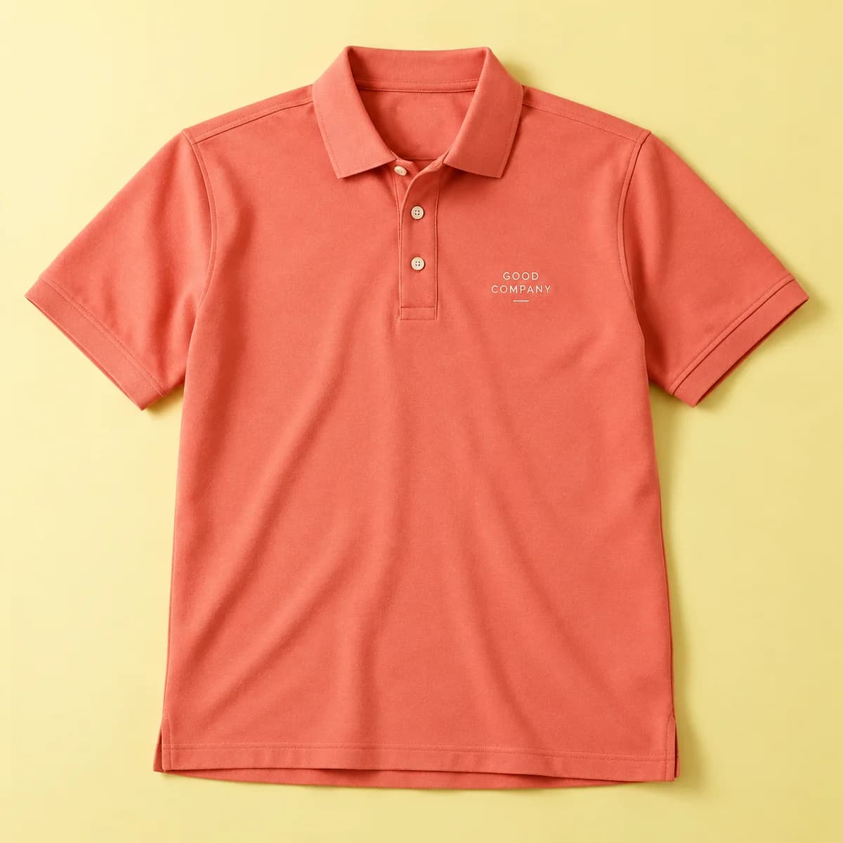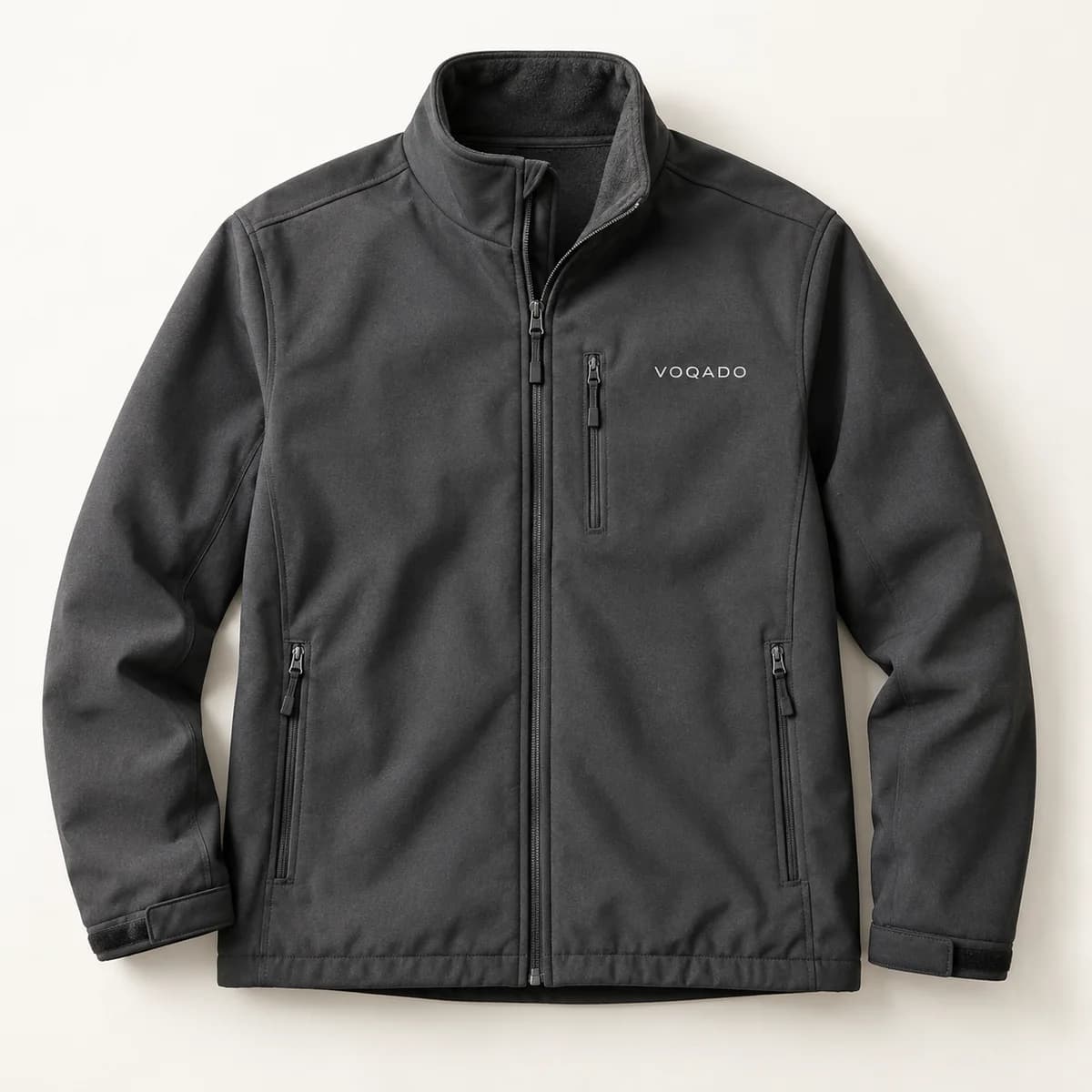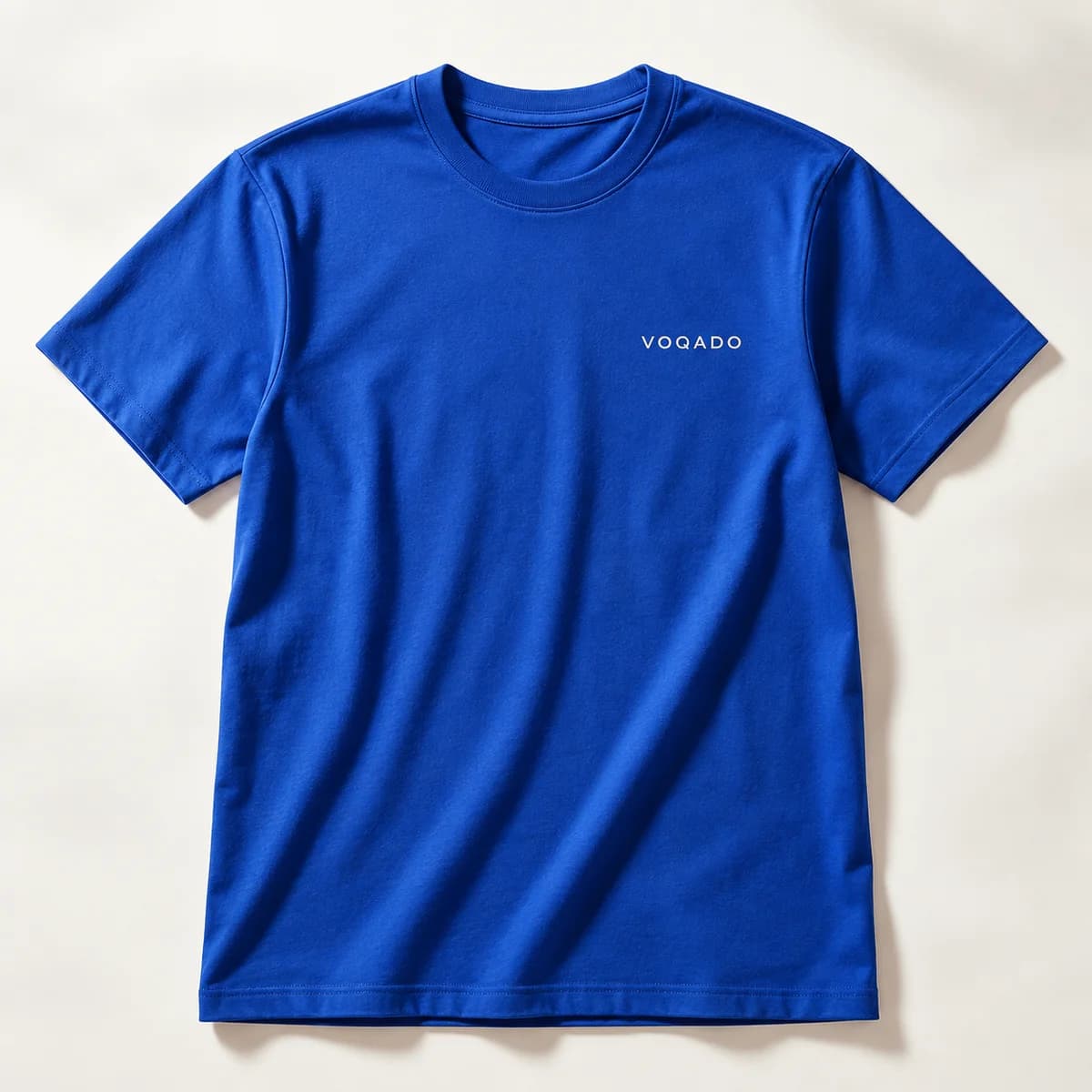
Why dark garments change everything
Ink on fabric is not paint on a wall. Most apparel inks are at least partly translucent, so a red printed straight onto navy becomes a muddy maroon. To get a red that reads as red, the press first lays down white in the shape of the artwork, cures it enough to hold, then prints the color on top.
That sequence has three consequences. The print is thicker and stiffer, because there are two layers where a light garment would have one. Fine detail is slightly less crisp, because the top layer has to register onto the underbase within a small tolerance. And the cost per piece rises, because there is an extra pass.
Direct to garment works the same way on dark fabric: a white underbase is printed and pretreated before the color, which is why dark garment printing behaves differently from printing on white in both cost and feel.
Which garment colors count as dark?
It is not a yes or no line. Think of it as three bands.
| Garment band | Examples | What the press does |
|---|---|---|
| Light | White, natural, pale grey | Color prints straight onto the fabric |
| Mid | Heather grey, tan, light blue | Depends on the ink and the artwork |
| Dark | Black, navy, forest green, red | Underbase needed for opaque color |
Heather grey is the interesting one. A deep saturated color may print on it without an underbase, while a pale yellow will not. If your artwork includes any light tint, assume an underbase.
The colors you can actually choose vary by product. Tank tops are made in White, Heather Grey, Black, Navy and Red, and that is their range. Aprons and tote bags use a natural leaning palette. Where a product does not publish a range, the swatches shown are common colors to ask for rather than a confirmed range, and your choice is confirmed with the supplier before printing.
How should artwork change for a dark garment?
Design the artwork for the garment, not the other way round. Four adjustments cover most cases.
- Thicken hairlines. A quarter point rule that looks elegant on white disappears into an underbase edge on black.
- Avoid very pale tints. A 10 percent tint of a color has almost no ink in it and will read as grubby white.
- Reconsider drop shadows and soft glows. A soft edge has to be built out of a soft underbase, which is where most dark garment prints look rough.
- Decide what the garment color is doing. If black is a color in your design, leave it unprinted and let the shirt be the black.
That last point is the most useful. A two color design on a black shirt that uses the shirt as its third color costs less, feels lighter and usually looks better than a three color design with a black block printed over black fabric.
Does contrast still matter?
Yes, and more than on paper, because fabric scatters light. A design that relies on a subtle difference between two mid tones will look like one tone at conversational distance.
A practical benchmark borrowed from screen accessibility is a contrast ratio of at least 4.5 to 1 for normal text and 3 to 1 for large text. You are not obliged to meet it on a T shirt, but if your wording falls below it on screen, it will fail on cloth. Print the artwork on paper, place it on the actual garment color, and look at it from across the room.
What about feel and weight?
A heavy underbase plus a heavy top layer produces the thick, slightly rubbery patch that people associate with cheap event shirts. It is not inevitable. Smaller prints, lighter coverage and designs with open space inside them feel dramatically better than a solid block of ink across the whole chest.
If feel matters, and it does for anything people will choose to wear again, reduce the printed area rather than the print quality. A bold 8 in mark with air inside it wears better than a 12 in solid rectangle.
How does washing treat a dark garment print?
The underbase is the layer that cracks first, and when it does, the garment color shows through as fine dark lines inside the artwork. That is why care instructions for printed apparel are so consistent: wash inside out, in cold water, and avoid high heat in the dryer.
Colorfastness is measured with accelerated laundering methods such as AATCC TM61, where a single 45 minute test approximates about five typical home launderings. Reactive dyed garments hold their own color well, which is worth knowing, because a faded shirt makes a perfect print look tired.
Dark garment printing checklist
- Assume an underbase for any color artwork on a dark garment.
- Thicken hairlines and drop very pale tints.
- Let the garment color be one of your colors where you can.
- Check contrast by holding the artwork against the actual garment color.
- Reduce printed area rather than print quality if feel matters.
- Confirm the garment color with the supplier, since not every product publishes its range.
Frequently asked questions
Why does printing on black shirts cost more?
Because an opaque white underbase has to be printed in the shape of the artwork before any color goes down, which is an extra layer and an extra pass. The same applies to direct to garment, where dark fabric needs pretreatment and a white base. Light garments skip that step entirely, which is why they are cheaper.
Can you print white on a dark shirt?
Yes, and it is the simplest dark garment print there is, because white ink is opaque and needs no underbase beneath it. A one color white design on black is usually the best value and the best feel you can get on a dark garment, which is why so much event and merchandise printing looks like that.
What colors should I avoid on a dark garment?
Very pale tints, which contain too little ink to cover, and colors close in value to the garment itself. A 10 percent tint reads as grubby white over an underbase, and a mid grey on navy disappears at a distance. Test by printing the artwork on paper and holding it against the actual garment color.
Will a dark shirt print feel stiff?
It can, because there are two ink layers rather than one. The size and coverage of the design matter more than the method: a bold mark with open space inside it feels far better than a solid block across the whole chest. If feel is important, reduce the printed area rather than the quality.
Sources & specification notes
The references below support the relevant technical or product details in this guide. Examples and checklists are not claims of practical testing or universal supplier requirements. Confirm the current specifications for your chosen product before production.
- AATCC TM61: Test Method for Colorfastness to Laundering ↗
Supports the statement that one 45 minute accelerated laundering test approximates roughly five typical hand or home launderings.
- W3C: Understanding WCAG 2.2 success criterion 1.4.3, contrast minimum ↗
Used as a contrast benchmark: at least 4.5 to 1 for normal text and 3 to 1 for large text, applied here to artwork against a garment color.