What is the quiet zone?
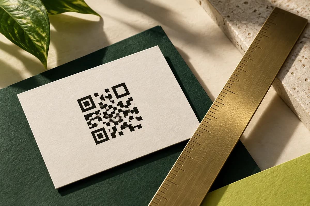
The quiet zone is the empty border around the symbol. It is measured in modules, the small squares the code is built from, not in millimeters, so it scales with the code.
That single fact catches people out. A code shrunk to fit a card also shrinks its quiet zone, so a margin that looked generous in the layout can fall below the minimum once the code is 15 mm across.
Work it out in real units. If a code is 29 modules wide and printed 17.4 mm across, each module is 0.6 mm, so the quiet zone must be at least 2.4 mm on every side. That is the empty space your layout must protect, and it belongs outside the code, not inside the card's safe margin.
What counts as breaking the quiet zone?
Anything that is not blank background.
- A colored panel or photograph running under part of the margin.
- A rule, border or frame drawn around the code.
- Text placed tight against the code, including a caption underneath.
- The trim edge of the card itself.
- A fold, score or painted edge.
A border around a code is the most common mistake, because designers add it to make the code look deliberate. If you want a frame, put it outside the quiet zone, so the sequence from the code outward is: code, blank margin of at least four modules, then frame.
How much contrast does a code need?
Scanners look for a difference in reflectance between dark and light modules. In practical print terms, that means dark modules that are genuinely dark and a light background that is genuinely light.
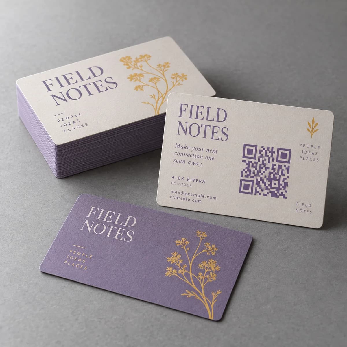
The safest specification is solid black on white. Where brand color is unavoidable, treat it the way you would treat text contrast: the W3C contrast guidance for text asks for at least 4.5 to 1 for normal text, and a code built to that or better is far more forgiving than one that merely looks different on screen.
Two specifics matter on paper. First, mid tone brand colors such as medium blues, greens and reds often have far less tonal separation from white than they appear to have in RGB. Convert the design to grayscale and look at it: if the code loses definition, a scanner will struggle too. Second, a light colored code on a dark background is an inversion, and while many modern scanners handle inverted codes, older ones do not. If the card must be dark, print a light panel behind the code and keep the code dark on light.
Does the printing surface change the minimums?
It changes how much headroom you need above them. Ink spreads slightly on uncoated stock, which thickens dark modules and narrows light ones, so a code near the minimum size on uncoated paper benefits from extra quiet zone. Glossy stock holds detail well but adds glare, which effectively reduces contrast at certain angles.
On dark cards, the reversed panel behind the code should be a solid, even tone rather than a soft gradient, and it should extend at least through the full quiet zone, ideally a little further so that slight trimming variation cannot eat into it.
What about codes printed over images?
Avoid it. A photograph behind a code varies in tone across the symbol, so some light modules are darker than some dark modules, which is exactly the condition a scanner cannot resolve.
If the design demands a photographic card, place a solid rectangle behind the code, sized to include the whole quiet zone, and accept the rectangle as part of the design. A clean white block on a photograph looks intentional; a half readable code does not.
How do you check it before approval?
A short visual check catches nearly everything.
- Measure the module width: code width divided by the module count.
- Multiply by four, and confirm that much blank space exists on every side.
- Convert the layout to grayscale and confirm the code still reads as high contrast.
- Confirm nothing crosses the margin, including rules, captions and the trim.
- Confirm the code is dark on light, not light on dark.
- Print at 100 percent and scan, then test again on the real stock.
The guide to why a card QR code fails in the room covers the physical tests that follow this file check, and the sizing arithmetic lives in the guide to QR code size on a business card.
What is the quiet zone and contrast checklist?
- Keep at least four modules of blank space on all four sides.
- Recalculate the margin in millimeters after any resize.
- Keep borders, captions, panels and the trim edge out of the margin.
- Build the code dark on light, with real tonal separation.
- Put a solid panel behind a code on a dark or photographic card.
- Check the layout in grayscale before approving.
- Scan a printed sample, not a screen.
Frequently asked questions
How much white space does a QR code need around it?
At least four modules on every side, which is the margin DENSO WAVE specifies for the symbology. Because the margin is measured in modules rather than millimeters, work it out after you fix the printed size: divide the code width by the module count, multiply by four, and protect that much blank space in the layout.
Can a QR code be a brand color?
Only if the color is genuinely dark against a genuinely light background. Many mid tone brand colors have far less tonal separation from white than they appear to have on screen. Convert the design to grayscale: if the code loses definition there, a scanner will struggle with it too.
Can I use a white QR code on a dark card?
Many modern phone cameras handle inverted codes, but older scanners do not, and on a small card you have no margin for error. The safer approach on a dark card is a solid light panel behind a dark code, extended through the full quiet zone so trimming variation cannot cut into it.
Can I put a QR code on top of a photograph?
Not directly. A photograph varies in tone across the symbol, so some light modules end up darker than some dark modules and the scanner cannot separate them. Place a solid rectangle behind the code that includes the entire quiet zone, and treat that block as part of the design.
Sources & specification notes
The references below support the relevant technical or product details in this guide. Examples and checklists are not claims of practical testing or universal supplier requirements. Confirm the current specifications for your chosen product before production.
- DENSO WAVE: How to create a QR Code, margin and cell size ↗
States that a QR code requires a four module wide margin on all sides, and shows the relationship between print resolution and module size.
- W3C: Understanding WCAG 2.2 success criterion 1.4.3, contrast minimum ↗
Used as a practical contrast reference: 4.5 to 1 for normal text, applied here as a floor for colored code and background pairs.