What contrast ratio should business card text have?
The Web Content Accessibility Guidelines, published by the W3C, require a contrast ratio of at least 4.5 to 1 between normal text and its background, and at least 3 to 1 for large text, defined as 18 point or larger, or 14 point bold. Those numbers were written for screens, not paper, so they are not a print certification. They are still the best available yardstick for choosing colors before anything is printed.
On a business card, almost everything except the name falls well below 18 point, so the large text allowance rarely applies. Treat 4.5 to 1 as the minimum for contact details and aim higher, because printing tends to lower contrast rather than raise it.
| Card element | Typical role | Contrast target | Watch for |
|---|---|---|---|
| Name | Largest text on the card | At least 4.5 to 1 | Light display weights |
| Title and company | Secondary text | At least 4.5 to 1 | Pale accent colors |
| Phone, email, web address | Must be read accurately | Well above 4.5 to 1 | Thin type over images |
| Fine print or license line | Smallest text | Highest contrast on the card | Reversed text on dark stock |
| Logo | Recognition, not reading | Brand version on a clean field | Tinted backgrounds |
| QR code | Must scan | Dark code on light background | Missing quiet zone |
Why does contrast drop on paper?
A screen emits light, so bright backgrounds glow and dark text looks crisp. Paper only reflects the light in the room. Ink also spreads a little into the fibers, especially on uncoated stock, which softens edges and closes up counters in small letters. Dim restaurant lighting, glare from a gloss coating or a metallic finish can each cut readability further. The U.S. Government Publishing Office advises never to expect a printed piece to match a color visual, and contrast is part of that.
Which color combinations are risky on business cards?
The common failures are pale on pale, such as light gray on white or sage on cream, and mid tone on mid tone, such as red text on a green field, which can also be hard to separate for people with color vision deficiency. Colored text over a photograph changes contrast from letter to letter as the image changes behind it. Foil text can look striking in one light and vanish in another, because it reflects rather than absorbs light.
If a combination feels only just readable on screen, it will usually be harder to read on paper. Converting a design to grayscale is a quick check: if two colors turn into nearly the same gray, the pair relies on hue alone and will be weak for many readers.
How do you handle white text on dark cards?
Reversed text, meaning white or light letters knocked out of a dark background, has good contrast on paper but a different risk: the surrounding ink can creep into fine strokes and thin serifs. Use a slightly heavier weight than you would for dark text, avoid hairline fonts and keep small sizes away from full ink coverage where possible. The guide to proofing dark business cards covers rich black backgrounds and small reversed text in more detail.
How do you keep a QR code scannable with brand colors?
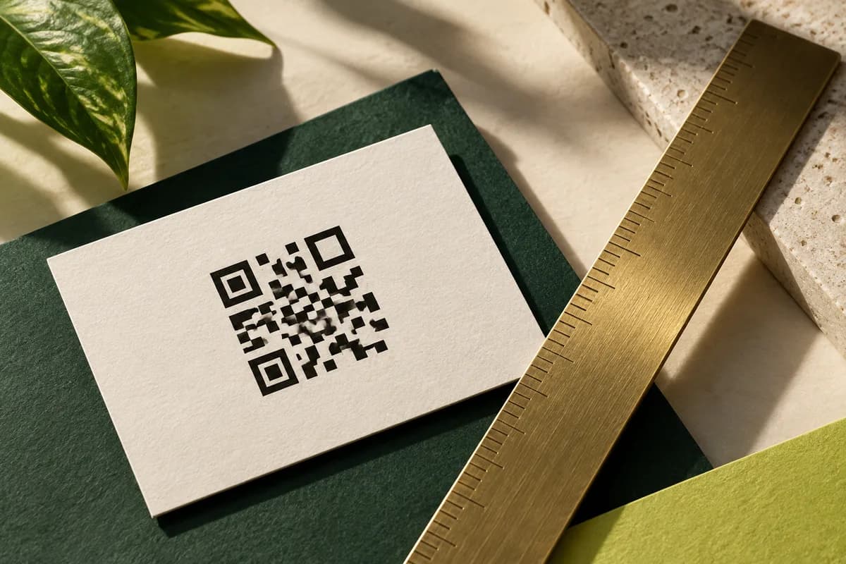
A QR code needs strong contrast between its modules and the background, and it needs its margin. DENSO WAVE, the company that developed the QR code, specifies a quiet zone four modules wide on every side, a clear area where nothing is printed. A dark code on a plain light background is the dependable choice. Avoid placing codes over photos, gradients or foil, and keep brand color for the area around the code rather than the code itself. The guide to QR code size for business cards explains how large the code should be for the distance it will be scanned from.
How do you test contrast before printing?
Start with a screen contrast checker to rule out obviously weak pairings, then move to paper. Print the design at actual size, hold it at arm's length and read every line under ordinary indoor light, then again near a window. Ask someone unfamiliar with the card to read the email address aloud. Paper choice changes the result, so paper samples of coated and uncoated stock show how your colors behave on each surface before you commit to a full run.
How do you keep brand colors and still pass contrast?
You rarely have to abandon a palette. Keep a pale brand color as an accent, for a band, an icon or the back of the card, and set the contact details in a darker color from the same family or in near black. Increase weight or size slightly where contrast is borderline; the font size guide suggests practical minimums for each line. Writing these color rules into a team specification is the core of keeping cards consistent across a team, because every new card then starts from combinations already proven to be readable.
Color contrast checklist
- Check every text color against its background with a contrast tool and aim above 4.5 to 1.
- Test the smallest line of contact details, not only the name.
- Keep text off busy photographs or place it on a solid panel.
- Use a heavier weight for reversed text on dark backgrounds.
- Print QR codes dark on light with a four module quiet zone.
- Review a physical proof at actual size in more than one light.
Frequently asked questions
What is a good contrast ratio for business card text?
Use at least 4.5 to 1, the minimum the W3C's WCAG guidelines set for normal size text, and aim higher for contact details. The guideline was written for screens, and printing on paper usually lowers perceived contrast, so a pairing that just passes on screen can look weak on a card. Confirm with a printed proof.
Is white text on a black business card readable?
Yes, when the text is large and heavy enough. White on black has high contrast, but ink can spread into thin strokes and fill small letters. Choose a regular or medium weight rather than light, avoid fine serifs at small sizes and review a printed proof, because the effect depends on the paper and printing process.
Can I print a colored QR code on my business card?
You can, as long as the code stays much darker than its background and keeps a clear margin. DENSO WAVE specifies a quiet zone four modules wide on every side. Deep navy or dark green on white usually works; pale codes, inverted codes and codes on photos or foil often scan poorly. Test the printed code with several phones.
Why is my business card text harder to read than on screen?
A screen lights the text from behind, while paper only reflects room light. Ink spreads slightly into the paper, softening small letters, and coatings or metallic finishes can add glare. Colors also shift when converted for printing. Darken the text color, increase the weight a little and judge the result on a printed sample.
Sources & specification notes
The references below support the relevant technical or product details in this guide. Examples and checklists are not claims of practical testing or universal supplier requirements. Confirm the current specifications for your chosen product before production.
- W3C: Understanding WCAG 2.2 Contrast (Minimum) ↗
Sets minimum contrast of 4.5 to 1 for normal text and 3 to 1 for large text, defined as at least 18 point or 14 point bold.
- DENSO WAVE: QR code size and quiet zone ↗
Specifies that a QR code requires a quiet zone four modules wide on all sides where nothing is printed.
- U.S. Government Publishing Office: GPO Publishing Guidelines ↗
Advises never expecting the color of a final printed piece to match a furnished color visual, due to physical differences between inks, toners and paper.