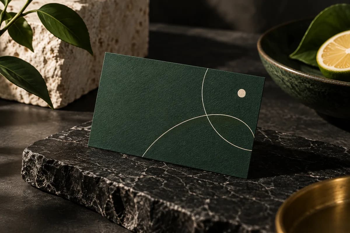
Why are dark business cards harder to read?
Light text on a dark background is called reversed or knockout type. The paper shows through where the ink is absent, so the letters are formed by the space between inked areas. Ink spreads slightly on paper, and on a dark flood that spread narrows thin strokes and closes small counters in letters such as e and a.
The problem grows as type gets smaller or lighter in weight. An email address in a thin typeface can look crisp on screen and become hard to copy on paper. Uncoated stock absorbs more ink, so the effect is often stronger there than on matte or glossy coated stock.
How small can reversed text be on a dark card?
There is no single standard for every press, so follow your printer's rules. As a reference, MOO's business card guidelines ask for all text at 8pt or higher and lines of 0.5pt or thicker. For reversed text on a dark flood, it is safer to stay above those minimums and choose a regular or medium weight rather than a light one.
| Element on a dark card | Safer choice | Riskier choice |
|---|---|---|
| Contact details | 8pt or larger, regular or medium weight | Below 8pt, light or thin weight |
| Fine lines and rules | 0.5pt or thicker | Hairlines |
| Typeface style | Open sans serif or sturdy serif | Delicate script or high contrast serif |
| Text color | White or very light tint | Mid gray or saturated color |
| Background | Printer approved dark color | Unapproved heavy ink mix |
Contrast matters as much as size. The W3C accessibility guidance for text, written for screens, sets 4.5 to 1 for normal text and 3 to 1 for large text. Printed cards are not measured against that rule, but it is a useful benchmark when choosing a gray or colored text on a dark background.
How should a dark background be built for print?
Ask the printer. A dark area can be printed with black ink alone, with black plus other inks for a deeper result, or with a spot color, and the right recipe depends on the press, paper and finish. Adding too much ink in one area can cause drying, rubbing or setoff problems, so printers set a total ink limit. Do not copy a rich black formula from another supplier or a forum post.
Keep small text out of multicolor black. If fine type is built from several inks, any small shift between plates can leave colored fringes. Many printers recommend that small text sit on a background whose inks all knock out cleanly, or that small black text use black ink only. The guide to RGB vs CMYK business cards explains how screen color converts to printing ink.
What should a dark card proof test?
Build the proof around the hardest parts of the design. Use the longest email address, the smallest reversed line and the largest dark area. Print it at 100 percent scale, cut it to size and read it under normal room lighting, not only under a bright desk lamp.
Then ask someone who has not seen the design to copy the email address and phone number without help. If they hesitate over any character, increase the size, choose a sturdier weight or add letter spacing. Changing only the background color rarely fixes a letterform that is too delicate.
Which paper and finish suit a dark card?
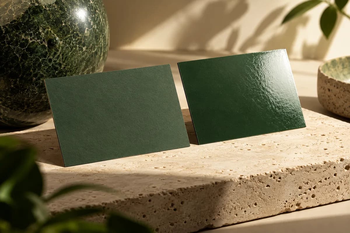
Matte and soft touch surfaces make dark colors look deep and reduce glare, which helps legibility. Glossy stock gives richer blacks but reflects overhead light across the whole card. Uncoated stock gives a softer, less saturated dark and spreads ink more. Soft touch business cards pair well with dark designs, and a spot gloss accent can add contrast without adding ink.
Dark floods also show handling marks. Scuffs and fingerprints are more visible on a dark matte surface, so hold a sample the way people will carry the card. The business card color contrast guide covers color pairs in more depth.
What should you check on a dark business card proof?
- Keep reversed text at or above the printer's minimum size, and above 8pt where possible.
- Choose regular or medium weights for contact details.
- Keep lines at 0.5pt or thicker.
- Ask the printer how the dark background should be built.
- Keep small text out of multicolor black.
- Extend the dark background through the full bleed.
- Keep all text inside the safe area.
- Proof at actual size under ordinary room light.
What should you check after changing color or finish?
Any change to the background color, stock or finish changes the contrast between text and background. Recheck the smallest text after every change, and compare the new proof with the old one side by side. Confirm the back of the card too, because a light back with dark front needs its own orientation and trim check.
Keep the approved color specification with the order record rather than a screen screenshot, so a later reorder matches. When a design mixes a dark flood and fine detail, the business card proof checklist is a good final pass before approval.
Frequently asked questions
What is the minimum font size for white text on a black business card?
Follow your printer's specification first. As a reference, one major printer's guidelines ask for all text at 8pt or higher. Reversed text loses a little stroke width as ink spreads, so it is safer to go slightly larger and use a regular or medium weight for contact details. Proof it at actual size and ask someone to copy it.
Should I use rich black for a dark business card background?
Ask the printer. A rich black, which adds other inks under black, can look deeper than black alone, but the right mix depends on the press and paper, and too much ink can cause drying or rubbing problems. Keep small text out of multicolor black, because slight plate shifts can create colored edges around fine letters.
Which paper is best for a dark business card?
Matte and soft touch stocks are popular because they make dark colors look deep and reduce glare, which helps small text. Glossy stock gives strong blacks but reflects light across the card. Uncoated stock spreads ink more, so dark colors look softer and thin reversed type can close up. Handle a sample before deciding.
Why does my dark business card look different from the screen?
Screens emit light in RGB color, while printed cards reflect light from ink on paper, so deep screen colors often print lighter or duller. Paper, finish and room lighting change the result further. Screen appearance alone is not a production specification, so approve a color built for print, keep it with your order record and judge a physical sample when color matters.
Sources & specification notes
The references below support the relevant technical or product details in this guide. Examples and checklists are not claims of practical testing or universal supplier requirements. Confirm the current specifications for your chosen product before production.
- MOO: business card design guidelines ↗
Product example: text at 8pt or higher and lines of 0.5pt or thicker; follow your own printer's current rules.
- W3C: Understanding contrast minimum (WCAG 2.2) ↗
Screen guidance of 4.5 to 1 for normal text and 3 to 1 for large text, used here only as a benchmark for printed text.