What is the difference between RGB and CMYK?
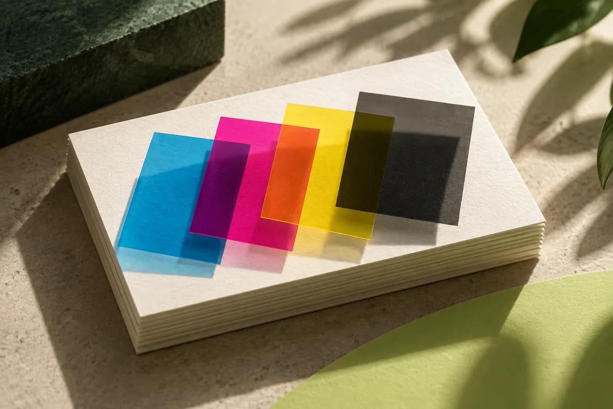
RGB starts with a dark screen and adds light. Full red, green and blue together make white, which is why the U.S. Government Publishing Office describes RGB as additive color. RGB values are also device dependent: the same numbers look different on two monitors with different settings. CMYK starts with white paper and subtracts light by laying down inks that absorb it. More ink makes a darker result, and the paper itself supplies the white.
| Aspect | RGB | CMYK |
|---|---|---|
| How color is made | Emitted light, added together | Ink on paper, absorbing light |
| Primary colors | Red, green, blue | Cyan, magenta, yellow, black |
| Where white comes from | All channels at full strength | Unprinted paper |
| Native to | Monitors, phones, cameras | Offset and digital presses |
| Typical range | Wider for bright, saturated colors | Narrower, limited by ink and paper |
| Best use for a card file | Photos before conversion, screen previews | The final press file when the printer asks for it |
Why do colors look different in print than on screen?
A screen is backlit and can show saturated colors no ink combination can reach. Paper reflects room light, and its shade and coating change how ink sits on the surface. Coated stock keeps ink on top and looks crisper; uncoated stock absorbs more and softens color. The GPO guidelines put it plainly: never expect the color of a final printed piece to match a furnished color visual.
Color management narrows the gap without closing it. ICC profiles describe how each device reproduces color, and a color management system uses them to convert values between a device space and a device independent reference space. That is how a file made on one monitor can be reproduced on a specific press and paper with predictable results.
Should you convert your business card to CMYK yourself?
Ask the printer first. Some workflows want a CMYK file built with a named profile. Others accept RGB and convert it with profiles tuned to their presses and paper. The PDF/X standards reflect both approaches: the earliest profiles support CMYK only, while later ones accept RGB inside a color managed workflow.
If you convert yourself, you see the shift before you approve, which is useful. The GPO notes that converting RGB to CMYK causes a color shift that can then be corrected in professional image software. If the printer converts, you depend on its proof to show the result. What you should avoid is converting back and forth between modes without a plan, because each conversion can change the numbers. When you prepare the print PDF export, record which mode and profile you used so a reorder can repeat it.
Which colors shift the most from RGB to CMYK?
Vivid, glowing colors lose the most. Electric blues, bright greens, saturated oranges and anything close to neon often fall outside what CMYK inks can print, so conversion pulls them toward a duller neighbor. Soft neutrals, earth tones and most skin tones convert with little visible change. If your brand relies on one bright color, check it early in CMYK soft proofing and decide whether the printed version is acceptable or whether a spot color is worth considering.
How should you handle black on a business card?
Small text and thin lines are safest in plain black ink only. Building fine text from four inks invites slight misregistration, which shows up as colored fringes around letters. Large dark backgrounds are different: plain black can look flat or gray, so many printers recommend a rich black built with other inks under the black. The exact recipe varies by press and paper, so use the printer's value rather than a formula from the internet. Dark designs need extra care, and the guide to proofing dark cards covers small text on black backgrounds.
When is a spot color better than CMYK?
A spot color is a premixed ink matched to a named standard, used when a brand color must be consistent from job to job. The GPO warns that some spot colors cannot be adequately represented with four color process inks. If a card must match signage or packaging printed with a named ink, the comparison of Pantone versus CMYK explains when paying for a spot ink makes sense and when a careful CMYK build is enough. Metallic looks are another case: a screen gradient cannot promise metallic shine, which needs a foil or metallic ink.
How do you judge color before you approve?
Judge it on paper. A digital proof shows layout, not color accuracy, and it looks different on every screen. Printed stock samples show how your chosen paper handles ink, and a business card sample kit lets you compare coated, uncoated and textured surfaces in your own lighting. Look at the proof near a window and under indoor light, since both matter to the people who will hold the card. If a brand color must match a previous job, bring a card from that job and compare the two side by side.
Before sending anything, work through preparing artwork for print so resolution, bleed and fonts are checked alongside color.
Keep one master file
Keep an editable master with its original color information, and make a separate output copy for the workflow your printer specifies. Repeated conversions make problems harder to trace and the original appearance harder to recover. Record the profile and export settings you used so a later revision can follow the same path, and keep the printer's answer about accepted color spaces with the export.
RGB and CMYK checklist
- Ask whether the printer wants CMYK with a named profile or accepts RGB.
- Convert once, with a defined profile, and keep the original RGB source.
- Check bright brand colors in CMYK before approving.
- Set small text and thin lines in plain black ink.
- Use the printer's rich black recipe for large dark areas.
- Specify spot colors, foil or metallic effects separately.
- Judge color on physical samples, not on a screen.
Frequently asked questions
Should business cards be RGB or CMYK?
Printed business cards are produced with CMYK inks, so the file ends up in CMYK one way or another. Many printers ask you to supply CMYK with a specific profile. Others accept RGB and convert it themselves. Follow the printer's instruction, and if you supply CMYK, convert once from your original RGB artwork using the profile they name.
What happens if I send an RGB file to a printer?
The printer converts it to CMYK before printing. Colors that CMYK inks cannot reproduce, such as very bright blues, greens and oranges, move to the nearest printable color and can look duller. The U.S. Government Publishing Office notes that converting RGB to CMYK causes a color shift, so request a proof when color matters.
Why does my business card look darker than on my screen?
Screens emit light and are often set bright, while paper only reflects the light in the room. Ink also spreads slightly into paper, especially uncoated stock, which darkens midtones. Lower your screen brightness when reviewing, lighten very dark artwork a little if the printer advises it and judge the result on a printed sample.
Is CMYK the same as Pantone?
No. CMYK builds colors from four process inks printed in dots, while Pantone refers to premixed spot inks matched to a named standard. Spot inks give more consistent brand color across jobs and can reach some colors CMYK cannot. Many business cards print in CMYK only, so ask whether your product supports spot inks before specifying one.
Sources & specification notes
The references below support the relevant technical or product details in this guide. Examples and checklists are not claims of practical testing or universal supplier requirements. Confirm the current specifications for your chosen product before production.
- U.S. Government Publishing Office: GPO Publishing Guidelines ↗
Describes RGB as additive, device dependent color for displays, warns that RGB to CMYK conversion causes a color shift and that some spot colors cannot be matched with process inks.
- International Color Consortium: ICC profiles ↗
Explains that device profiles let a color management system convert color data between device color spaces and a device independent connection space.
- Library of Congress: PDF/X format family (ISO 15930) ↗
Notes that early PDF/X profiles support CMYK only while later ones accept RGB in color managed workflows.