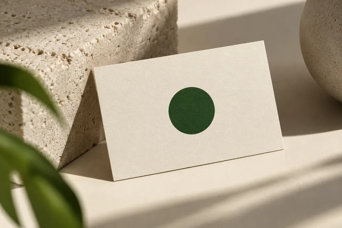
What belongs on a minimalist business card?
Start from what a stranger needs to remember you and contact you, then cut everything else. A name and a way to reach you are essential. A line saying what you do is essential when the business name does not explain it. Everything else is optional and should earn its place.
| Element | Keep it? | Why |
|---|---|---|
| Name | Always | The one thing every card must say |
| What you do | Usually | A new contact may not know your service |
| One contact method | Always | Phone or email, whichever you answer |
| Website | Often | Gives depth without adding text |
| Logo or mark | Often | Recognition, if it reads at small size |
| Second phone or fax | Rarely | Adds clutter for little use |
| Social handles | Rarely | Better behind one website link |
| Full street address | Only if visitors come to you | Takes several lines |
The broader guide on what to put on a business card covers the full list for cards that are not minimal. A useful shortcut is to ask what a recipient would search for if they lost your card. If the answer is your name and your service, both belong on the face in readable type.
How do you create hierarchy with so few elements?
With few elements, each difference in size, weight or position becomes obvious, so use them on purpose. Decide which one element is read first, usually the name or the mark, and make it clearly larger or heavier. Give everything else one consistent treatment. If every element is the same small, light size, the reader has no starting point and the card feels empty rather than calm.
Position matters as much as size. A name alone in the upper left with contact details grouped at the bottom right creates a clear path. Scattering four small items across the card breaks that path.
How small can the text be on a minimalist card?
Minimal designs are tempted toward tiny, pale type, which looks refined on screen and disappears in print. The minimum font size guide explains practical limits for names and contact lines. Contrast matters just as much. The W3C contrast guidance for screen text sets 4.5 to 1 for normal text and 3 to 1 for large text of at least 18 points. Print is not measured that way, but light grey type on white or cream stock often falls well below those ratios and becomes hard to read in a dim room.
How should empty space be used?
Empty space is structure, not leftover area. Pick one alignment, such as a strong left edge or a centered column, and hold every element to it. Keep consistent margins from the trim so the layout feels deliberate, and group related details together so the gaps separate ideas. The W3C readability guidance also recommends generous line spacing, around one and a half times the type size, and that habit keeps a two or three line contact block easy to scan.
Check spacing at actual size. A layout that feels airy on a large monitor can look cramped or lost once it is printed at 3.5 by 2 inches.
Margins deserve special attention on a sparse card, because the edges are more visible when little else is printed. Keep the same distance from the trim on every side where text sits, and allow for the small shift that happens when sheets are cut. A name placed very close to one edge can look intentional on screen and accidental on the finished card.
Which papers and finishes suit a minimalist design?
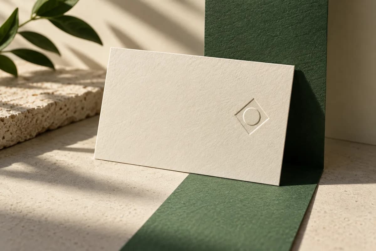
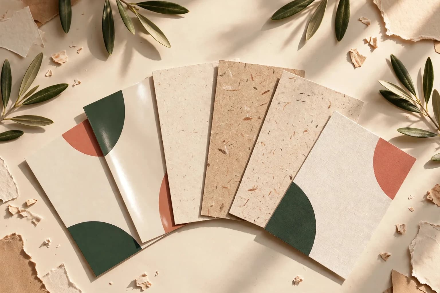
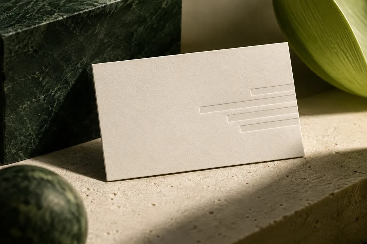
When the layout is quiet, the material becomes part of the design. Soft, natural cotton paper gives a simple card a crafted feel. A colored painted edge adds one detail that is visible from the side without adding anything to the face. Uncoated and textured stocks add character but soften fine lines, so keep strokes bold. A single foil or spot gloss element can highlight the mark, as long as essential text does not rely on the effect to be readable.
Should a minimalist card use the back?
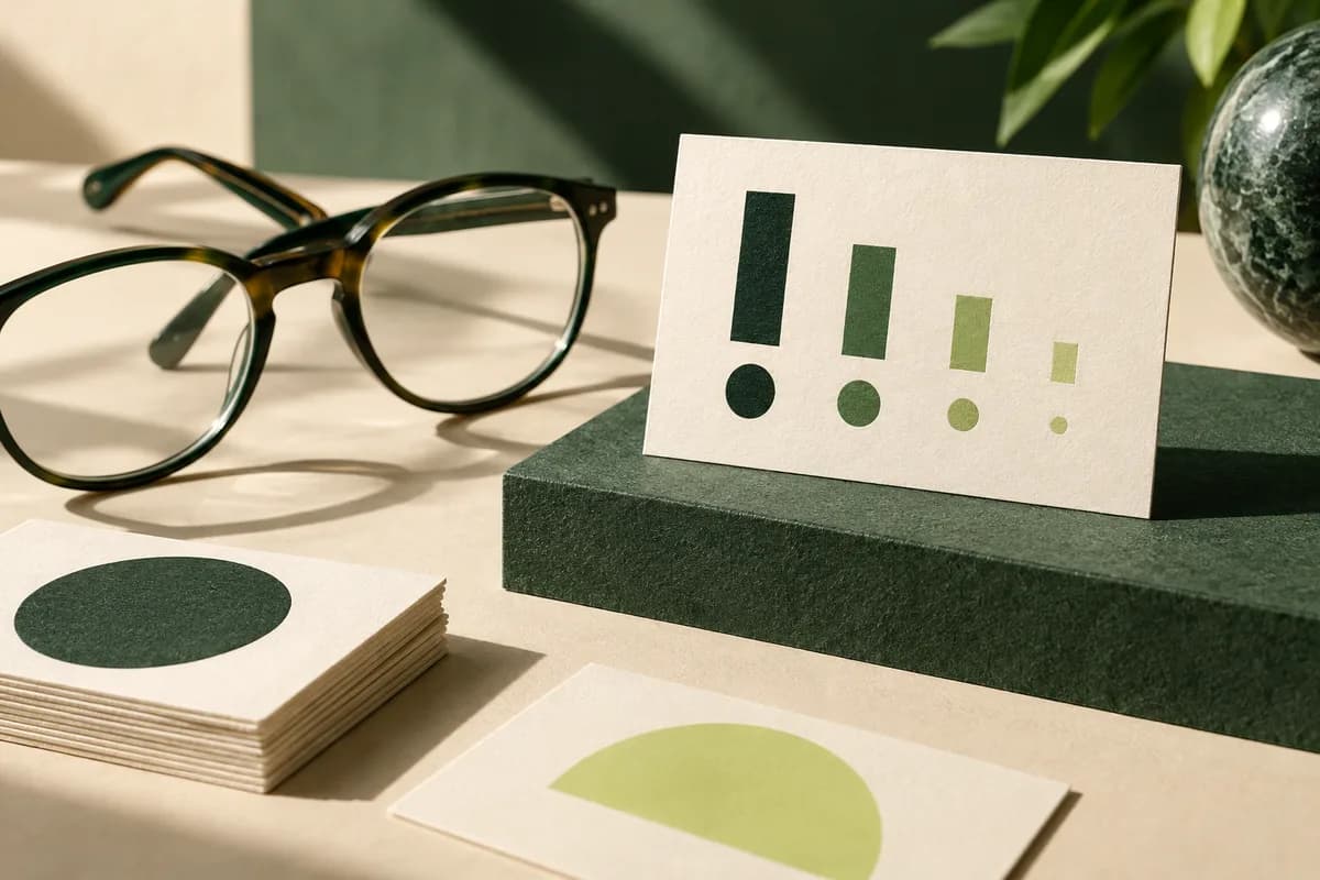
It can, if the back has one job. A solid brand color, a single mark or open space for a note all keep the minimal feel. A back crowded with services and links undoes the front. The collection of business card back ideas shows options that stay restrained.
What are the common mistakes with minimalist cards?
- Type so small or pale it cannot be read in ordinary light.
- A cryptic mark and URL with no hint of what the business does.
- Removing the only contact method a new client would use.
- Fine hairlines that break up on textured or uncoated paper.
- Dark backgrounds with thin reversed text.
- Designing only on screen and never checking the printed size.
How do you test whether a design is minimal enough?
Try a subtraction exercise. Remove one element and compare the two versions at actual size. If the card is clearer and nothing a new contact needs is lost, keep the simpler version. If something important is gone, put it back. Repeat until every remaining element has a reason to be there.
Then hand the printed mockup to someone who does not know your business and ask two questions: what do you do, and how would you contact me? If they can answer both in a few seconds, the card is minimal in the right way. If they hesitate, add back the missing line rather than more decoration. The business card maker lets you try versions with your own details quickly, and a printed proof on the chosen paper is the final check before you order.
Frequently asked questions
What should a minimalist business card include?
Include your name, a line saying what you do if the business name does not explain it, one contact method you actually answer, and optionally a website and a mark. Drop second phone numbers, long social lists and full addresses unless visitors come to you. Every element that remains should help a new contact remember you or reach you.
Are minimalist business cards professional?
Yes, when they stay readable and informative. A clean card with clear hierarchy and good paper reads as confident. It turns unprofessional when minimalism removes the information a new contact needs, or when type is so small and pale that it cannot be read. Check the printed card at actual size in ordinary light before ordering.
What paper is best for minimalist business cards?
Papers with character suit simple layouts because the material becomes part of the design. Cotton, uncoated and textured stocks feel crafted, and a painted edge adds a single visible detail. Textured and uncoated papers soften fine lines, so use bold strokes. Order samples first if the feel of the paper is central to the design.
How do I keep a minimalist card from looking empty?
Give it a clear lead element and a strong alignment. Make the name or mark noticeably larger or heavier than everything else, group the contact details together, and align everything to one edge or one centered column. Empty space should separate ideas rather than scatter them. A good paper or one finish detail also adds richness without adding text.
Sources & specification notes
The references below support the relevant technical or product details in this guide. Examples and checklists are not claims of practical testing or universal supplier requirements. Confirm the current specifications for your chosen product before production.
- W3C: Understanding WCAG 2.2 Success Criterion 1.4.3 Contrast (Minimum) ↗
Screen contrast ratios of 4.5 to 1 for normal text and 3 to 1 for large text of at least 18 points, used here as a reference for printed type.
- W3C: Understanding WCAG 2.2 Success Criterion 1.4.8 Visual Presentation ↗
Guidance on line width and line spacing of at least one and a half times for readable text blocks.