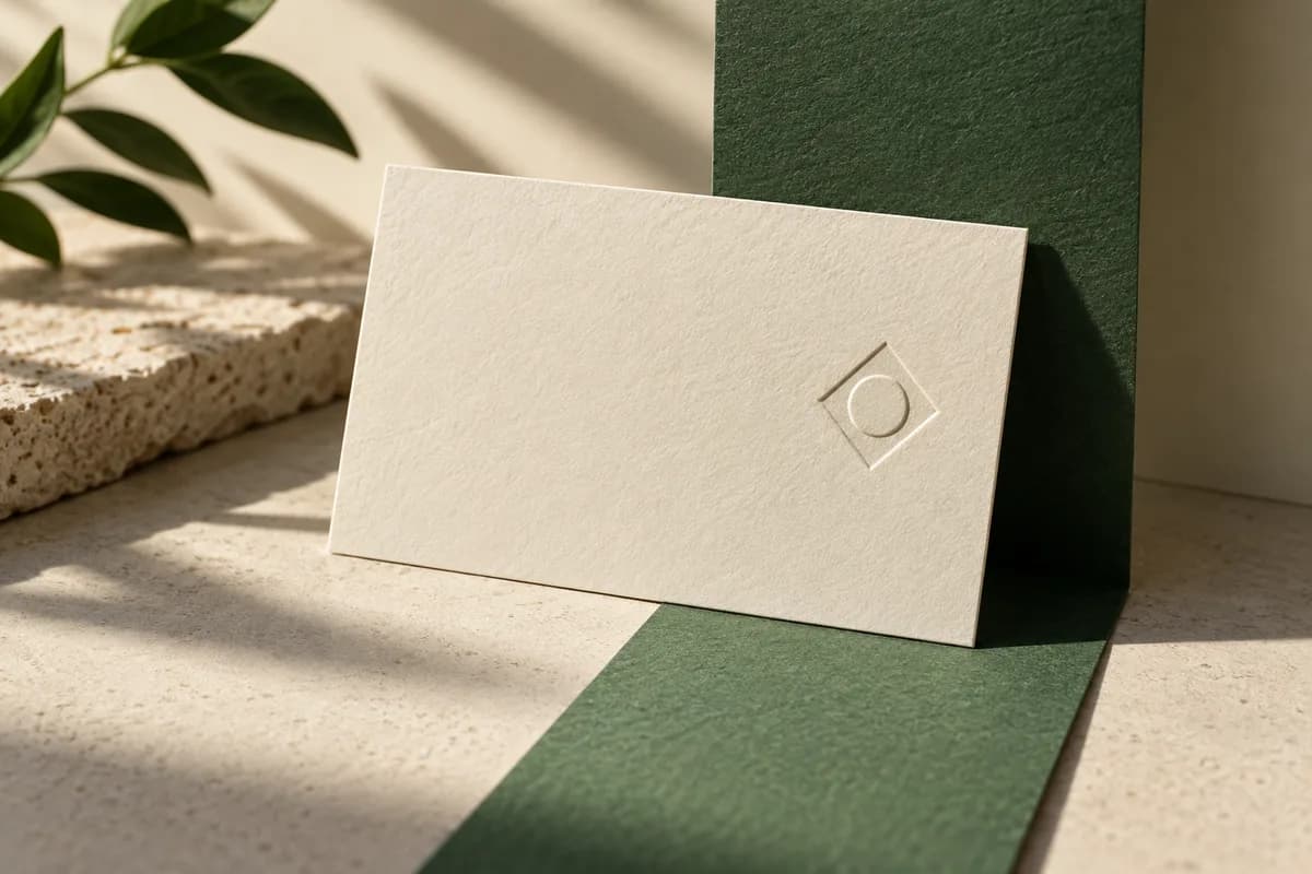
Where do designers usually place the logo on a business card?
Placement follows reading order. People scan a card from the top left, find the name, then look for the way to get in touch. The logo should support that path, not interrupt it. These six layouts cover most cards.
| Layout | Logo position | Works best for | Watch out for |
|---|---|---|---|
| Classic corner | Top left of the front | Most businesses, wide wordmarks | Crowding the name below it |
| Name lockup | Left of the name, same height | Compact symbols | Symbol and name competing |
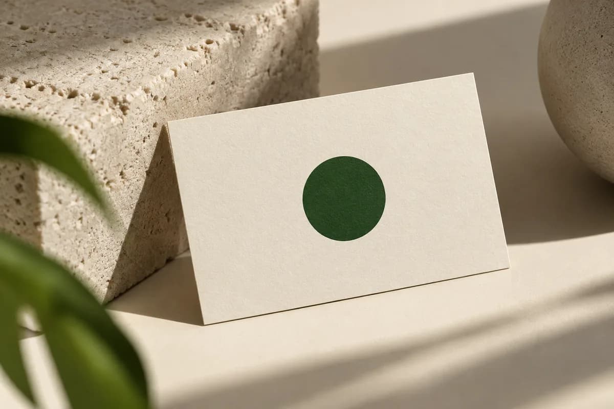
| Brand front | Centered alone on the front | Strong symbols, two sided cards | Contact details moved to the back |
| Brand back | Centered alone on the back | Busy fronts, bold colors | Back side costs on one sided orders |
| Right anchor | Top or bottom right of the front | Balancing left aligned text | Looking like an afterthought |
| Vertical header | Top center of a vertical card | Tall symbols, creative fields | Less room for long titles |
Start with the layout that fits the shape of your mark. A long horizontal wordmark sits naturally across the top. A square or round symbol is easier to center or pair with a name.
How big should a logo be on a business card?
There is no single correct size, but there is a correct test: print it at actual size. A dense symbol can carry as much visual weight at half an inch as a light wordmark does at an inch and a half. If your brand guidelines set a minimum size, follow it. If they do not, try two or three sizes and choose the smallest one where every detail and letter is still clear.
Size is also limited by the file. A raster logo can only grow as far as its pixels allow, so check the effective resolution before enlarging it. If the mark looks soft at the size you want, see the blurry logo fixes before redesigning the layout around it.
How much clear space does a logo need?
Clear space is the empty margin kept around a logo so other elements do not crowd it. Many brand guidelines define it with a unit taken from the mark itself, such as the height of one letter, so it scales with the logo. Without guidance, leave at least the height of the logo's smallest letter on every side, and more between the logo and the contact block.
The card edge counts too. Keep the full logo inside the safe area defined by the printer's template; the profile for standard Voqado cards, for example, uses a 0.07 inch safe inset. A logo tucked into a corner needs the same distance from both edges or it will look misaligned after trimming.
Should the logo go on the front or the back?
On a one sided card, the logo shares the front with everything else, so keep it modest and let the name lead. On a two sided card, you can give the logo the whole back and keep the front for information, or do the reverse for a bolder brand statement. Decide how the back turns relative to the front, since a vertical front and horizontal back are easy to mix up; the guide to front and back orientation shows the common setups.
How do you align a logo that has uneven padding?
Logo files often include invisible margins, and many symbols are not rectangles. Aligning the file's bounding box can leave the visible mark looking off center. Align the artwork you can see: the left edge of the letters with the left edge of the text, or the optical center of a round symbol with the center of the card. Curved and pointed shapes usually need to extend slightly past a straight edge to look aligned.
How does logo placement affect QR codes and contact details?
Every element competes for the same small area. Decide the order of importance first, usually name, then contact method, then logo, then any QR code, and give each element space in that order. A QR code needs its own quiet zone of four modules on every side, as DENSO WAVE specifies, so it should not be squeezed next to the logo. The guide on what to put on a business card helps you trim content until the layout breathes, and minimalist layouts show how much a single strong mark can do with very little around it.
How do you check placement before printing?
Print two versions at actual size, one with the logo slightly smaller. If the smaller version makes the contact details easier to read while the brand stays recognizable, it is usually the better card. Check the logo in the exported file at full zoom for softness or clipping, and confirm it sits inside the safe area on every side. The free business card maker lets you try positions quickly before you commit to a final file.
Logo placement checklist
- Use the approved logo version and keep its original proportions.
- Choose a layout that suits the shape of the mark.
- Test sizes at actual scale and pick the smallest clear one.
- Keep clear space around the logo and the whole mark inside the safe area.
- Align the visible artwork, not the file's bounding box.
- Give the QR code its own four module quiet zone.
- Compare two printed versions before approving.
Frequently asked questions
Should my logo be on the front or back of my business card?
Either works. On a one sided card the logo goes on the front, usually top left or beside the name. On a two sided card you can place the logo alone on the back and keep the front for contact details, or feature the logo on the front and put details on the back. Choose based on which side people should see first.
How big should a logo be on a business card?
There is no fixed rule, so test at actual size. Print a few versions and pick the smallest one where every letter and detail stays clear and the contact details remain easy to read. Follow any minimum size in your brand guidelines, and make sure the logo file has enough resolution for the size you choose.
How far from the edge should a logo be on a business card?
Keep the entire logo inside the printer's safe area. Many templates set the safe area 0.125 inch inside the trim, and some profiles use a slightly smaller inset. Corner logos should sit the same distance from both edges so they still look aligned after cutting, and borders or fine details should stay well away from the trim.
Can I put a logo next to a QR code on a business card?
Yes, but give each its own space. DENSO WAVE specifies a quiet zone four modules wide around a QR code where nothing else is printed, so the logo must sit outside that margin. Placing a logo inside the code can reduce scanning reliability. Test the printed card with several phones before ordering the full quantity.
Sources & specification notes
The references below support the relevant technical or product details in this guide. Examples and checklists are not claims of practical testing or universal supplier requirements. Confirm the current specifications for your chosen product before production.
- DENSO WAVE: QR code size and quiet zone ↗
Specifies a four module quiet zone on all sides of a QR code where nothing is printed, which limits how close a logo can sit.
- U.S. Government Publishing Office: GPO Publishing Guidelines ↗
Recommends scanning line art at 800 to 1200 ppi and scaling images before placement, both relevant when resizing a raster logo on a card.
- W3C: Scalable Vector Graphics (SVG) 2, Introduction ↗
Describes SVG as a language of vector shapes, images and text, the basis for logos that scale cleanly to any placement size.