
THE EVERYDAY ESSENTIAL
Standard business cards
From $10.0050 items
The classic handshake in card form. Clean, reliable, and ready to carry your name wherever you go.
Choose options Start without artwork · Tax and delivery shown before payment.Explore business cards and poster printing for designers, photographers, architects, and independent creative studios.
A studio is judged on judgment. Whatever you hand a client is read as a demonstration of taste before anyone reads the words on it, so the paper choice and the poster crop are the pitch. That makes stock selection a design decision here rather than a budget one, and it makes color accuracy between the screen you approved on and the sheet that arrives the thing most worth protecting.
The classic handshake in card form. Clean, reliable, and ready to carry your name wherever you go.
Choose options Start without artwork · Tax and delivery shown before payment.The 3.5 by 2 inch, 14pt baseline with 13 stock choices, so you can change the paper without redesigning the card.
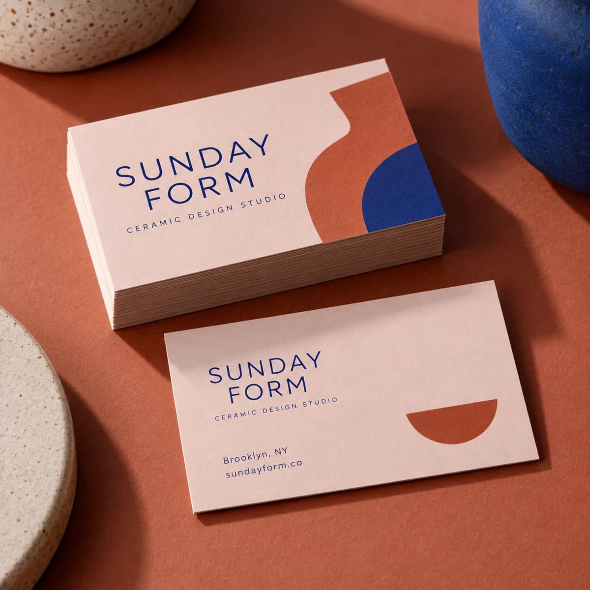
An introduction you can feel. Soft touch paper has a velvety texture that makes every handoff a little moment.
Choose options Start without artwork · Tax and delivery shown before payment.A velvety surface that rewards a restrained layout, for a studio whose pitch is judgment rather than a service list.
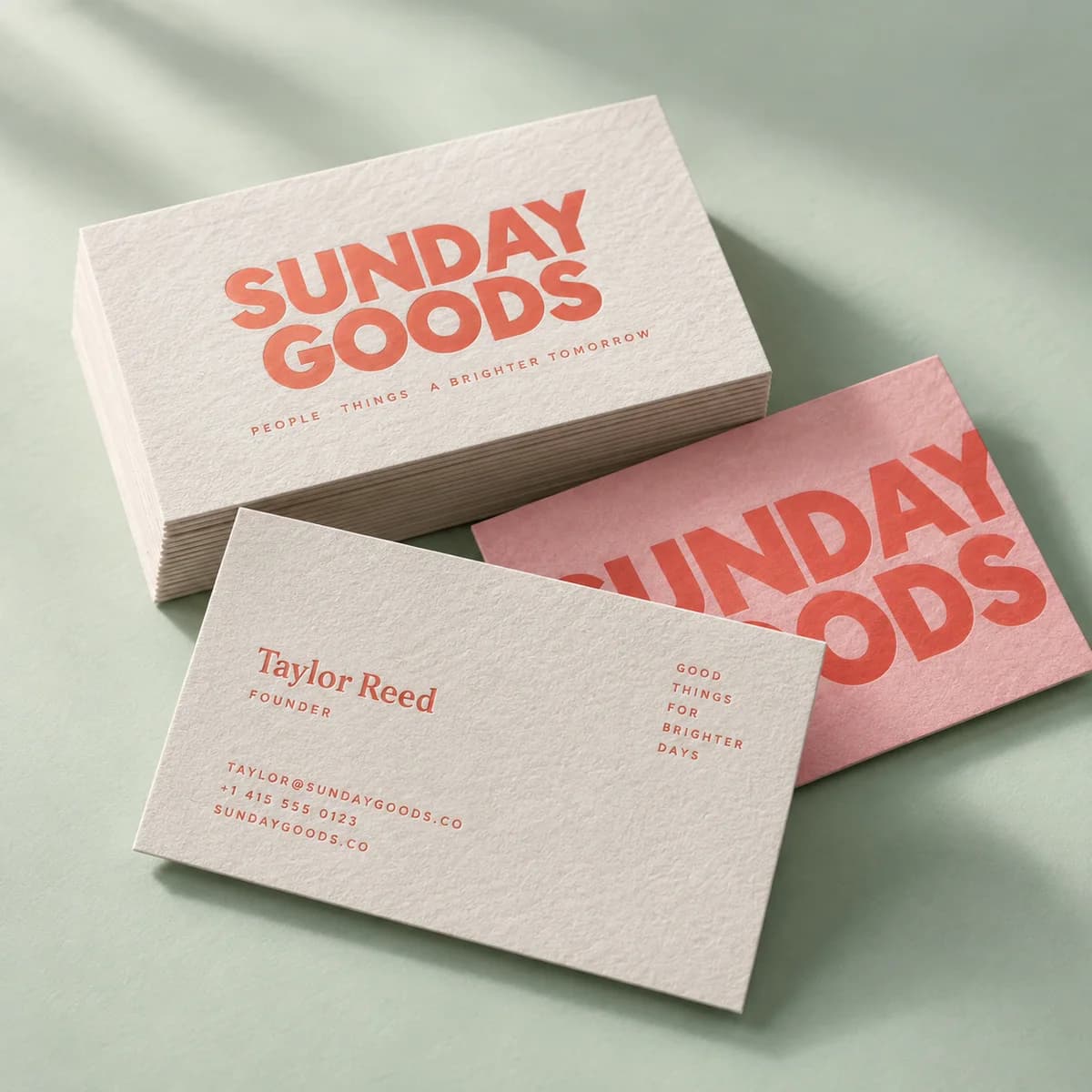
A little softness. A lot of character. Cotton paper gives your card a classic, crafted feel.
Choose options Start without artwork · Tax and delivery shown before payment.A soft natural stock with a stationer's character, best with open layouts and type set large enough to survive the surface.

Make the whole wall your canvas.
Choose options Start without artwork · Tax and delivery shown before payment.Sized for a wall rather than a portfolio, with optional lamination when a project hangs in a lit studio space.
A prospect leaves a meeting with a deck they will not reopen and a card they will put in a drawer. That card is the last physical evidence that your studio has taste. Photographers and designers tend to over design it, filling the back with services when the surface itself is the argument. Set your name, your discipline in plain words and one way to reach you, then spend the rest of the budget on the paper. A restrained layout on an unusual stock reads as confidence. A busy layout on a standard stock reads as a template, which is the one thing a studio cannot afford to look like.
The stocks that feel best in hand are the ones that treat ink worst. Cotton has a soft natural surface that lets fine detail spread, so a hairline rule or six point type loses its edge. Soft touch has a velvety coating that sits above the fiber and mutes a saturated color rather than letting it sing. Kraft and natural textured stocks start brown or cream, so every color printed on them is mixed with that base and no white ink exists to stop it. None of that is a flaw, but you have to design for it. Order the sample kit and look at your own palette on the exact stock before you commit a run, because a studio explaining a color shift to a client has already lost the conversation.
Studios print posters for two reasons: to show a project on a wall and to give a client something they will actually hang. The second only happens if the poster fits a frame that exists. Sizes of 11 by 14, 18 by 24 and 24 by 36 inches are standard retail frame sizes, so a recipient can hang the piece the same week. A custom trim size forces custom framing, which quietly guarantees the poster stays rolled in a tube. Decide the frame first, then design inside it, and leave a margin that a mat will not eat. If the poster goes into a studio space with strong light, lamination protects it, at the cost of a surface sheen you have to art direct around.
Copyright notice has not been required in the United States since the Berne implementation, and your photographs and illustrations are protected the moment they are fixed whether you mark them or not. Marking them still does one concrete thing: under 17 USC 401, when a proper notice appears on the copies a defendant had access to, no weight is given to a defense of innocent infringement in mitigation of damages. A poster, a printed portfolio sheet or a leave behind is exactly the kind of copy that circulates beyond the person you gave it to. A small line with the symbol, the year of first publication and your studio name costs nothing and removes an argument later.
Let your work lead. Pair a confidently typeset business card with a poster that gives a project room to shine. Use the same color and typography across both, and choose a surface that supports the kind of work you show.
Build your brand kit →The one that suits the work rather than the most expensive one. Soft touch reads as considered and modern, and it favors a restrained layout because the surface is the effect. Cotton reads as craft and stationery, and it wants open layouts and legible type since fine detail softens. Standard 14pt in uncoated reads as plain and confident. Order the sample kit of 16 materials and judge them next to your own palette rather than from a photograph.
Two things move it, and neither is the printer. A soft touch coating sits above the fiber and mutes a saturated color, and kraft or natural textured papers start off brown or cream, so every ink you lay down is mixed with that base and nothing prints white underneath to stop it. That is why the same file looks like a different palette on three stocks. Proof your own colors on the exact stock before a run, and choose a smooth white paper for the jobs where fidelity matters more than feel.
Pick a standard frame size so the client can hang it without a custom frame, which is the difference between a poster on a wall and a poster in a tube. Sizes of 11 by 14, 18 by 24 and 24 by 36 inches all map to frames people can buy. Design inside a margin a mat will not eat into. Check the resolution of your artwork at final size, since 24 by 36 inches at 300 dpi is a much larger file than a screen export.
You are not required to. Your work is protected from the moment it is fixed, and notice has been optional in the United States for decades. It still earns its space, because under 17 USC 401 a proper notice on copies a defendant had access to removes any weight from a defense of innocent infringement when damages are assessed. Printed posters and leave behinds travel past the person you handed them to, so a line with the symbol, the year and your studio name is worth the few millimeters.
Business card design decisions · 6 MIN READ
Eighteen business card design ideas grouped by goal, with the layout, type and paper choice that makes each one work when printed at 3.5 × 2 in.
Read the guide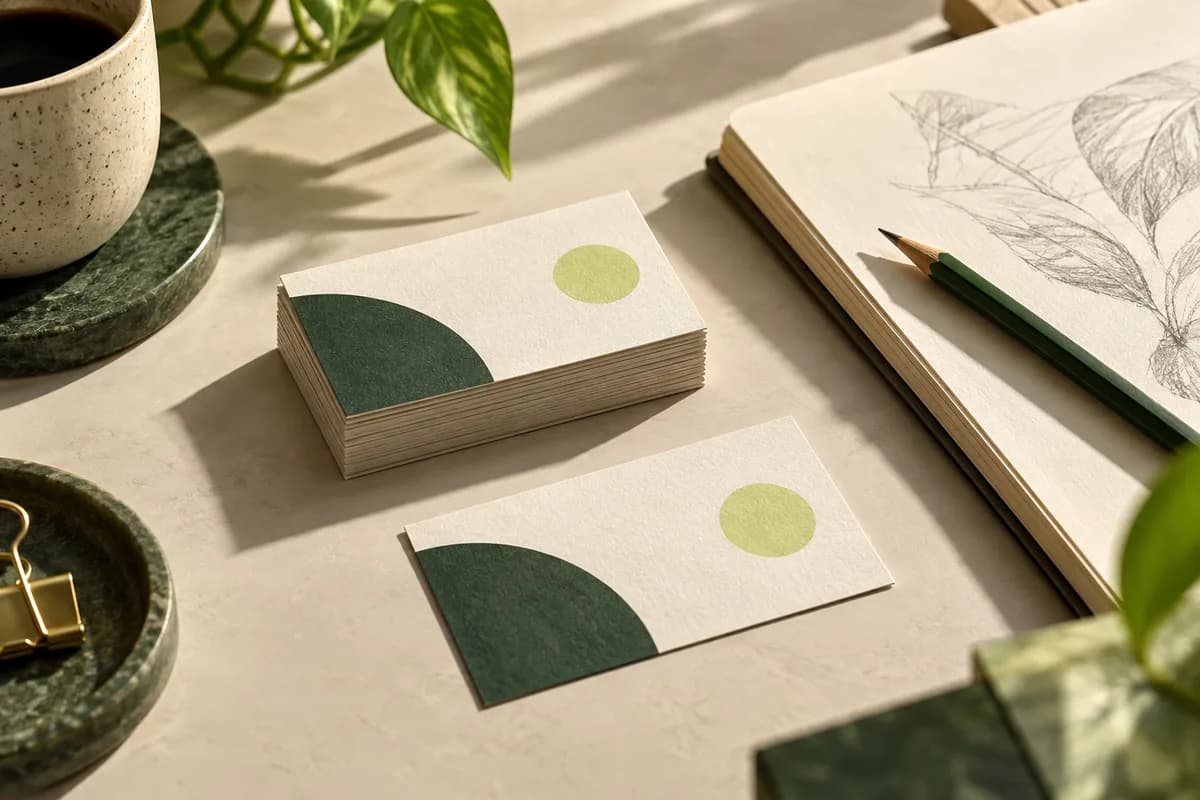
Business cards at work · 5 MIN READ
A freelancer business card should state your name, one clear specialty and one reliable contact route. See what to include, what to skip and how many to buy.
Read the guide
Print artwork & file preparation · 6 MIN READ
Turn screen brand colors into print ready values: define CMYK and Pantone equivalents, test on real paper, and set rules so every order matches the last.
Read the guide
Business cards by industry · 5 MIN READ
Tattoo artist business cards that book sessions: what to print, deposit and age lines, ultra thick stock, an aftercare back, and sample shop wording.
Read the guide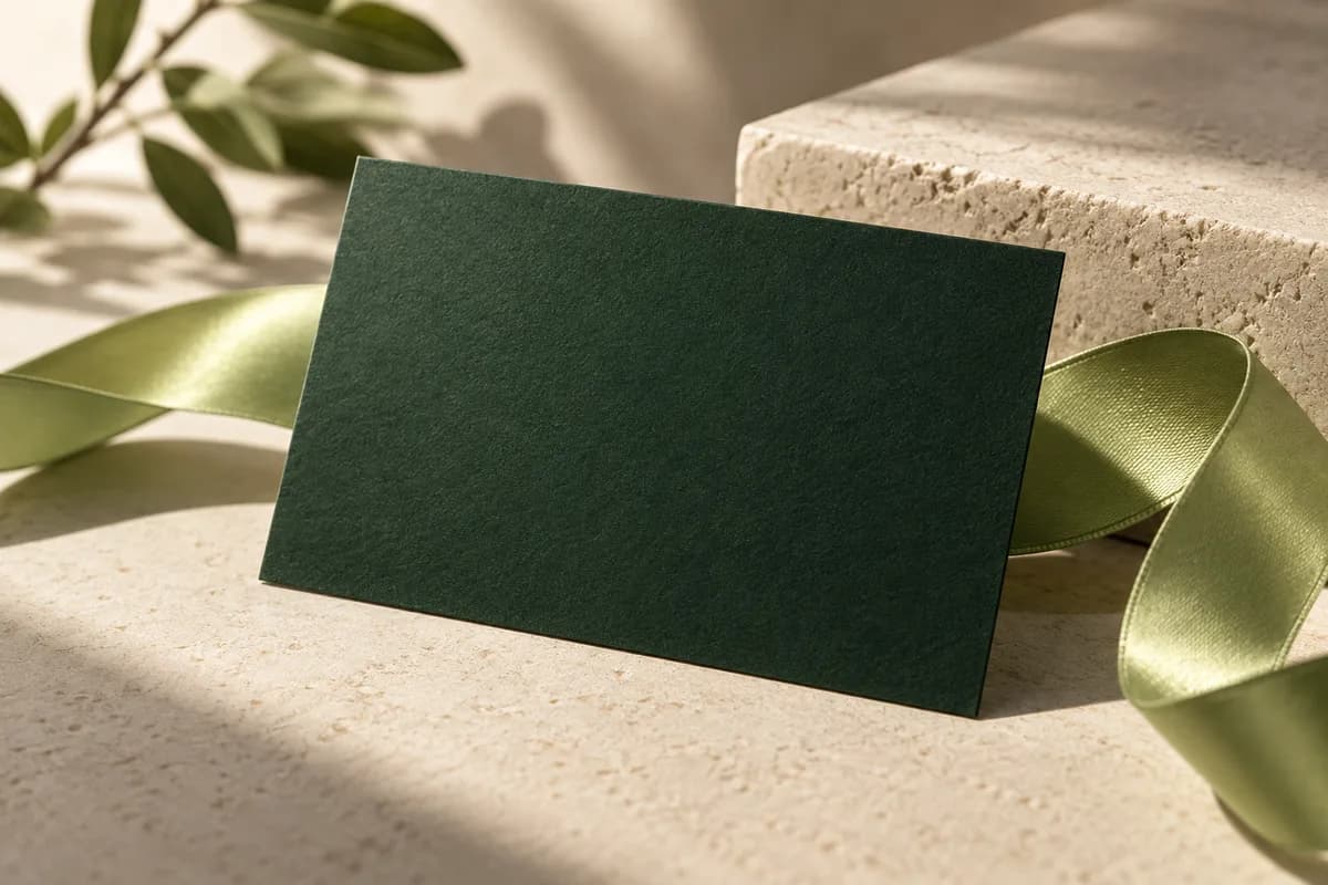
Business card paper & finishes · 5 MIN READ
Soft touch business cards explained: how the velvet laminate is made, how it compares with matte and gloss, durability, writing, foil pairing and price.
Read the guide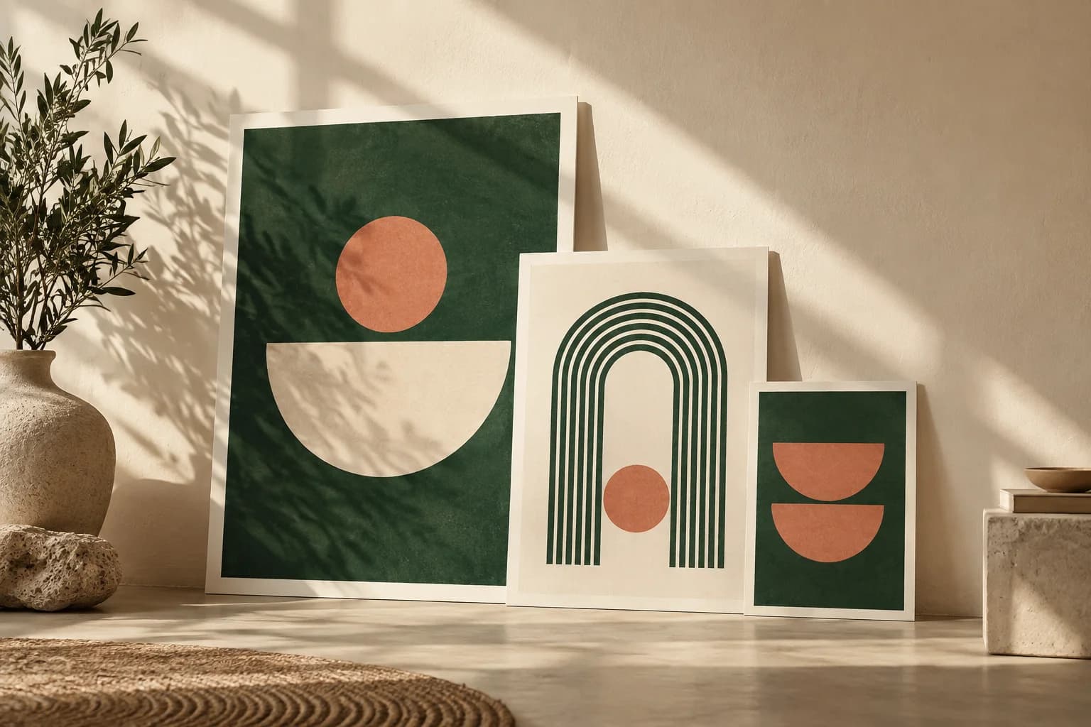 START HERE
Poster planning · 5 MIN READ
Standard poster sizes from 11 × 17 to 24 × 36 inches and A4 to A0, with pixel targets, aspect ratios and a simple way to pick a size from viewing distance.
Read the guideHelp us improve Voqado with analytics? Details