Why the apron is the garment that matters
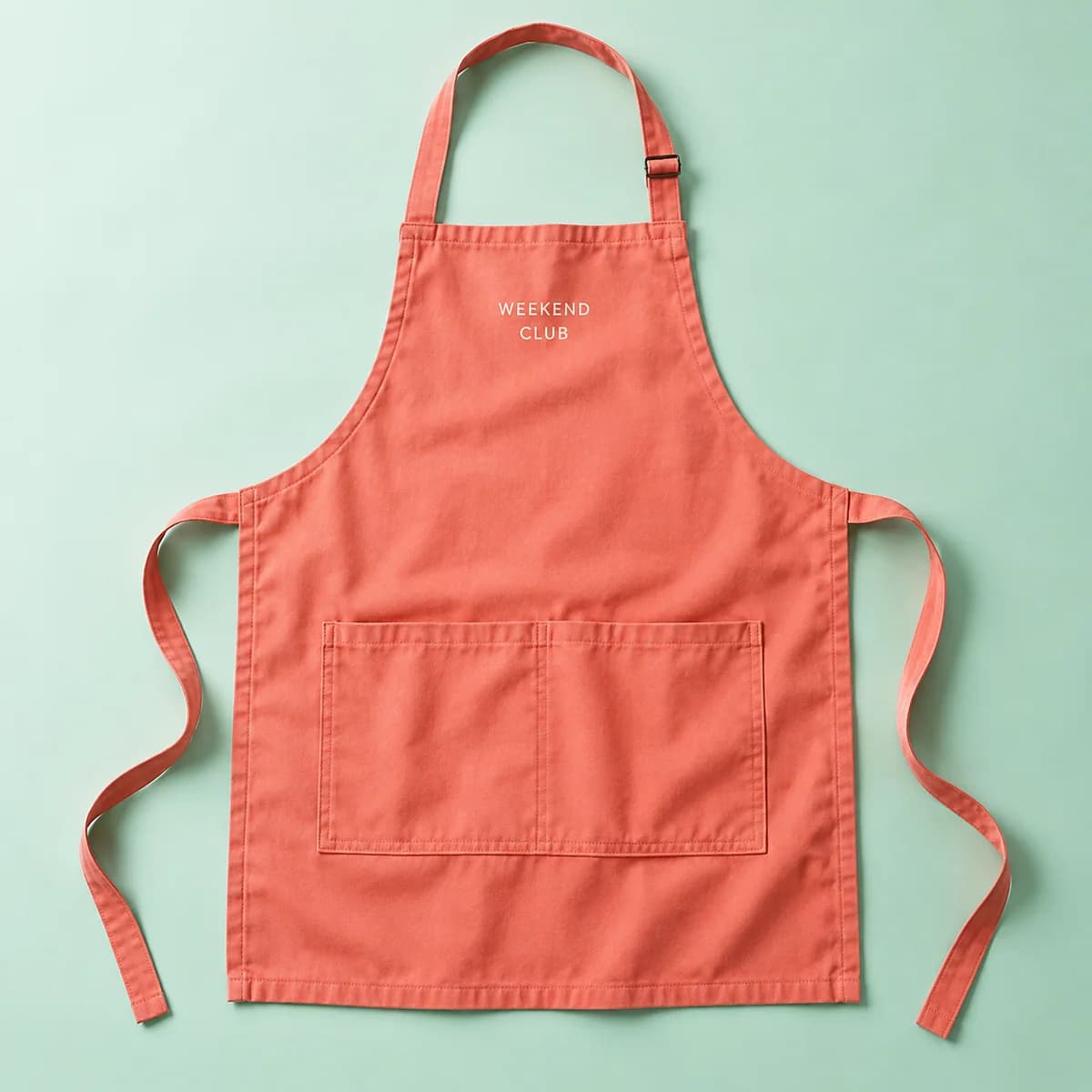
Think about the sightline. A customer at a counter sees a torso from roughly the waist to the shoulders, at three to five feet. A tee logo on the left chest is partly behind an arm. A cap is above the eyeline. The apron chest panel is dead centre, unobstructed and at exactly the right height.
That is also why an apron logo has to be right. It is on display longer than any other piece of branding in the room, including the menu.
Where does the logo go?
| Placement | Typical size | Works when |
|---|---|---|
| Upper chest, centered | 4 to 7 in wide | Bib aprons, the default |
| Upper chest, left | 3 to 4 in wide | A quieter, uniform look |
| Above the pocket | 3 to 5 in wide | Waist aprons and half aprons |
| Pocket face | 2 to 3 in wide | Small marks only, avoid seams |
| Waist tie or strap | Small | Rarely seen, skip it |
The constraint to design around is the pocket. Most aprons have a front pocket, often divided, and its top seam is a hard edge that decoration cannot cross cleanly. Keep artwork at least an inch above it. Keep it away from the neck strap hardware too.
The second constraint is the counter. If your service counter is chest height, anything below the mid chest is invisible for most of the shift. That alone argues for a higher placement than a designer working from a flat mockup would choose.
One size changes the design
Aprons here are one size, stated explicitly rather than left unsaid, as are caps, hats and every bag. If you need another size, add a production note and the supplier confirms what is available.
One size is convenient, but it means the apron sits differently on different people. A logo placed low looks correct on a tall person and sits near the waist on a shorter one. A logo placed high reads correctly on almost everyone. When in doubt, go higher than the mockup suggests.
It also means the neck strap length does the fitting. If your apron is adjustable, the chest panel position moves with the adjustment, which is another argument for a compact, centered mark rather than something that has to align with a body landmark.
Colors: what is actually on offer
The apron color row uses a natural leaning palette: Natural, Black, Navy, Heather Grey and Forest Green. Read that correctly. Where a product does not state a color range in its own specification, those swatches are common colors to ask for rather than a confirmed range for that product. You can pick one, or name another under Other, and the color is confirmed with the supplier before printing.
That is worth saying plainly because the alternative is worse. Four swatch rows on this site once offered colors the supplier does not make, and a customer could choose one, pay, and receive a confirmation problem instead of an apron. Products with a stated range now refuse an unavailable color before payment; products without one are confirmed with the supplier.
For a food business, the practical guidance is unchanged by any of that. Dark colors hide the shift. Natural and pale colors show it by the second coffee. If you want a light apron, order enough that they can be rotated and washed daily.
Decoration for something washed every day
An apron lives a harder life than a polo. It is washed hot in many kitchens, bleached in some, and dried in a commercial dryer.
Aprons in this range do not publish a decoration method. The catalogue is explicit: there is no published artwork template, the decoration template is sent before production, and the placement and decoration method are confirmed with you after you order. So state what you want and why.
When you do, say how the apron will be laundered. It changes the sensible answer. A commercially laundered apron is a hostile environment for a surface film, while thread stitched into a woven panel is much less bothered by it. Decoration durability is measured with accelerated laundering methods such as AATCC TM61, where one 45 minute test approximates roughly five typical home launderings, and commercial laundering is harsher than that.
Design so it survives a distance and a stain
Two practical rules cover most of it.
Keep the mark bold. An apron is read across a counter with steam, movement and a queue in the way. Fine lines and small straplines do not survive that, and they do not survive the wash either. A simple wordmark at 5 in wide beats a detailed crest at the same size.
Accept the stain. Aprons get marked, and a logo placed where hands wipe will be the first thing to look tired. High and centered keeps the mark out of the working zone.
Aprons alongside the rest of the uniform
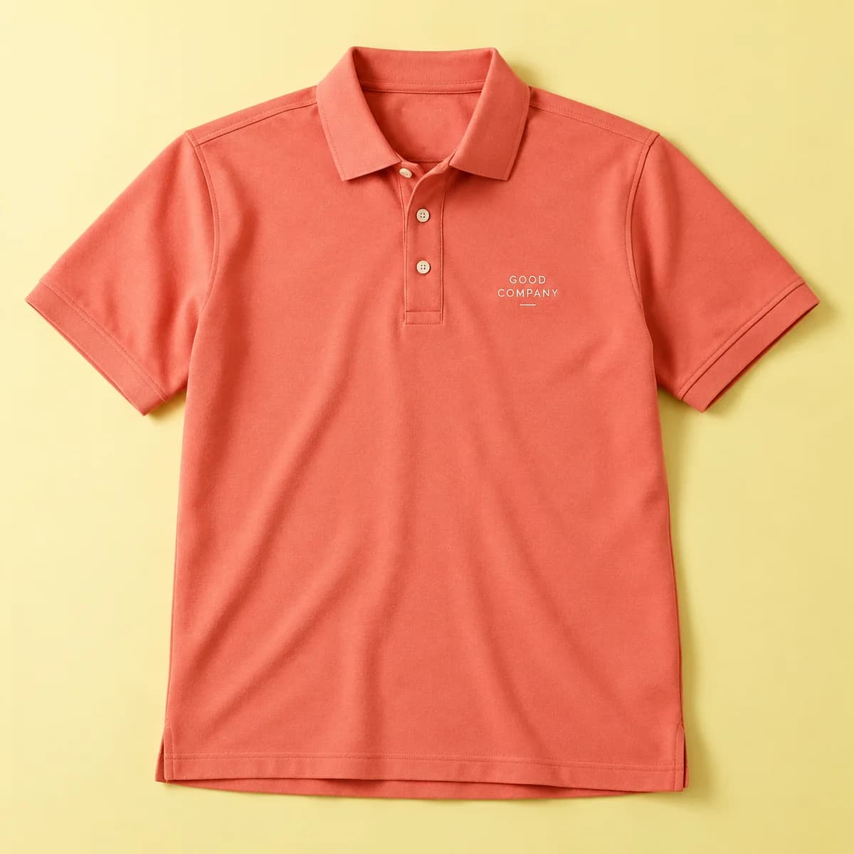
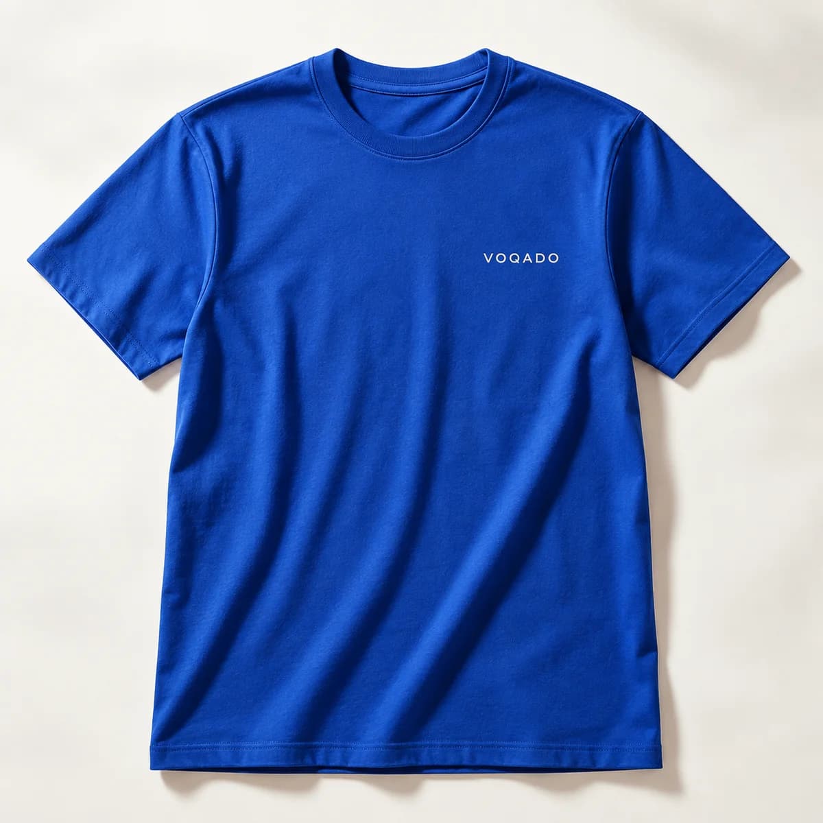
An apron rarely works alone. The common pairing is an apron over a plain or lightly branded tee, with embroidered polo shirts for front of house and a cap for anyone working near food. Use the same mark across all of them, redrawn once per method rather than scaled from one file.
Apron branding checklist
- Place the logo high on the chest, at least an inch clear of the pocket seam.
- Design for counter height, not for a flat mockup.
- Remember the apron is one size, so a higher placement suits more people.
- Treat the color swatches as colors to ask for unless the product states its range.
- Tell the supplier how the apron will be laundered before choosing a decoration.
- Keep the mark bold and out of the zone where hands wipe.
Frequently asked questions
Where should a logo go on an apron?
High on the chest panel, centered or slightly left, and at least an inch clear of the pocket seam and the neck strap hardware. Design for the height of your service counter rather than for a flat mockup, because anything below mid chest disappears behind the counter for most of a shift.
What size are the aprons?
One size, stated explicitly, as with caps, hats and every bag in this range. If you need another size, add a production note with your order and the supplier confirms what is available. One size means the apron sits differently on different people, which is why a higher logo placement suits more wearers.
What colors do custom aprons come in?
The color row shows a natural leaning palette of Natural, Black, Navy, Heather Grey and Forest Green. Because aprons do not state a color range in their own specification, treat those as common colors to ask for rather than a confirmed range. Name another color under Other if you need one and it is confirmed with the supplier.
Which decoration lasts on a commercially laundered apron?
Aprons here do not publish a decoration method, so it is confirmed with you after you order. Tell the supplier how the apron will be laundered, because commercial laundering with heat and bleach is much harsher on a surface film than on thread stitched into a woven panel. That information changes the recommendation.
Sources & specification notes
The references below support the relevant technical or product details in this guide. Examples and checklists are not claims of practical testing or universal supplier requirements. Confirm the current specifications for your chosen product before production.
- AATCC TM61: Test Method for Colorfastness to Laundering ↗
Supports the statement that one 45 minute accelerated laundering test approximates roughly five typical hand or home launderings, used here to compare decoration durability under frequent washing.
- FTC: Clothes Captioning, Complying with the Care Labeling Rule ↗
Supports the point that care instructions must cover bleaching and drying, which is the information a commercial laundry needs before it processes branded aprons.