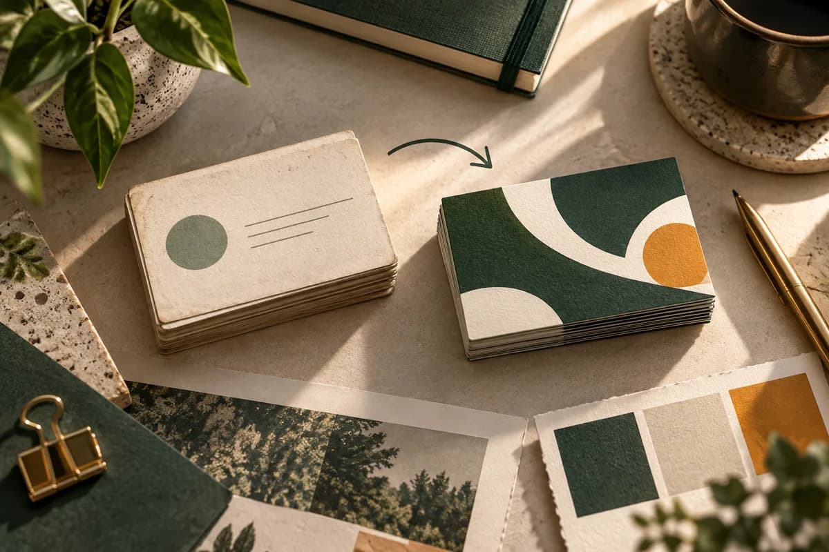
Why do business card redesigns lose recognition?
Recognition is built from repeated exposure to the same signals. The US Patent and Trademark Office describes a trademark as a word, phrase, symbol, design or a combination of these that identifies your goods or services, and a business card carries several of those signals at once. When a redesign swaps the name treatment, the color and the layout in a single step, a returning customer has nothing familiar to anchor on.
Most redesigns do not fail because the new card looks worse. They fail because the change was not tied to a specific problem. A card that was hard to read, carried an old phone number or pointed to a dead web page needs a fix. A card that simply felt dated may only need better spacing and a cleaner type hierarchy.
Which elements should stay the same?
Start with an inventory of the current card. List every element and mark whether customers are likely to associate it with the business. The table below is a practical starting point.
| Element | Recognition value | Typical decision |
|---|---|---|
| Logo or symbol | High | Keep; refine only the drawing quality |
| Primary brand color | High | Keep the hue; adjust tint for contrast |
| Business name treatment | High | Keep the wording and order |
| Layout and orientation | Medium | Keep if it is distinctive |
| Typeface for contact details | Low | Change freely for legibility |
| Taglines and offers | Low | Update or remove when out of date |
| Paper and finish | Medium | Keep if people mention how it feels |
Anything in the high row deserves a reason before it changes. Anything in the low row can change whenever it improves clarity. If you are not sure what belongs on the new card at all, the guide on what to put on a business card covers the core content in priority order.
How do you decide what the redesign must fix?
Write one sentence that names the problem, such as "the email address is too small to read" or "the card still lists the old office." Then list the evidence: comments from customers, returned mail, or a proof that failed a readability check. A redesign brief with a named problem keeps the work focused and gives you a way to judge the result.
Readability is a frequent reason to redesign. Small type, light gray text and busy backgrounds all make contact details harder to copy. The guide on business card font size gives practical minimums, and contrast deserves its own check, because a color that looks strong on screen can print lighter on uncoated stock.
How do you test the new card against the old one?
Print both designs at 100 percent scale with identical contact details and cut them to 3.5 x 2 inches. Put them side by side. Then run two short checks.
First, show the new card to someone who already knows the business and ask whether it still feels like the same company. Second, show it to someone who does not know the business and ask what the business does and how to contact it. The first check tests recognition. The second tests clarity. Neither check predicts sales, and neither needs to.
Keep a short decision log while you compare proofs. Note each change and whether it fixes a problem or reflects a preference. Preference changes are not wrong, but they are the first ones to drop if the new card starts to feel unfamiliar.
What should change before the new card is printed?
Every printed destination must work before production starts. Confirm that the website address, booking page, phone number and email on the card are live and correct. If the redesign adds a QR code, test it at printed size and keep a written web address as a backup route. DENSO WAVE, the company that developed the QR code, specifies a clear margin at least four modules wide on every side of the symbol, so leave that space in the layout rather than squeezing the code against the edge.
Update the website, email signature and other stationery at the same time. A customer who receives the new card and then visits a site with the old look sees two identities and may wonder whether both belong to the same business.
How many redesigned cards should you order first?
Order a first run that covers a few weeks or months of normal handoffs, not a year. A smaller run lets you see the physical result, gather comments and correct small issues before committing to a large quantity. The business card quantity planner turns weekly handoffs, a time horizon and a reserve into an order quantity.
Archive the previous design and its approved file. That record helps you tell the difference between an intentional brand change and an accidental difference in color or layout on a later reorder.
What is on a business card redesign checklist?
- Name the problem the redesign solves in one sentence.
- List the logo, color and layout cues customers already recognize.
- Keep high recognition elements unless the brand itself is changing.
- Improve contrast and type size for all contact details.
- Confirm every printed URL, phone number and email before approval.
- Test any new QR code at printed size with its four module margin.
- Compare old and new proofs at actual size with identical content.
- Order a modest first run and archive the old approved file.
When is a full rebrand the better choice?
A full rebrand makes sense when the business name, ownership, services or audience has changed enough that the old identity is misleading. In that case recognition of the old card is not the goal, and a clean break with clear communication works better. Tell existing customers directly, update every channel at once, and use the rebranding print checklist to catch the signs, forms and packaging that also carry the old identity.
For a refresh, a practical path is to keep the brand cues, fix the problem, and choose a paper that suits the new layout. Standard business cards are a sensible base for a first run, and a paper change can come later once the layout is settled.
Frequently asked questions
How often should a business card be redesigned?
There is no fixed schedule. Redesign when the card causes a real problem, such as unreadable contact details, a changed address, a new service or a logo that has been updated elsewhere. If the card still works and matches the website, a refresh of spacing and type is often enough, and it protects the recognition you have already built with customers.
Can I change my logo on a business card without confusing customers?
Yes, if the change is gradual. Keep the core shape, color or letterforms and refine the drawing quality rather than replacing the symbol outright. Update the website, signage and email signature at the same time as the card, so customers meet the refined logo everywhere and do not wonder whether the new card belongs to the same business.
Should a redesigned business card include a QR code?
Only when it leads somewhere useful, such as a booking page or contact file. Test it at the printed size, leave a clear margin at least four modules wide around it as DENSO WAVE specifies, and keep a written web address as a backup route. A QR code should add a shortcut, not replace information people need to read.
What should I test before approving a redesigned card?
Print it at 100 percent scale, cut it to 3.5 x 2 inches and compare it with the old card using identical details. Ask one person who knows the business if it still feels familiar and one stranger what the business does. Then dial the phone number, open the website, send a test email and scan any code.
Sources & specification notes
The references below support the relevant technical or product details in this guide. Examples and checklists are not claims of practical testing or universal supplier requirements. Confirm the current specifications for your chosen product before production.
- USPTO: What is a trademark? ↗
Defines a trademark as a word, phrase, symbol, design or a combination of these that identifies your goods or services and helps customers recognize a business.
- DENSO WAVE: QR code size and margin ↗
States that a QR code requires a margin four modules wide on all sides.
- W3C: Understanding contrast minimum (WCAG 2.2) ↗
Screen accessibility guidance; useful as a starting benchmark for text contrast on printed cards.