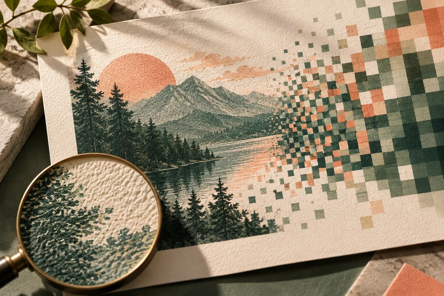
Why do posters print darker than they look on screen?
A monitor makes color by adding red, green and blue light, and most displays run far brighter than the light a printed sheet reflects in a room. Paper can only return part of the light that falls on it, and ink or toner absorbs some of that. The result is that shadows close up, dark tones merge and bright colors lose some punch once they move from glass to paper.
The range of colors also differs. Many vivid screen colors, especially electric greens, oranges and blues, sit outside what process inks can reproduce, so the printing system must substitute the nearest printable color. Ink also spreads slightly as it sits on paper, which makes midtones and shadows print a little heavier than the file suggests.
The U.S. Government Publishing Office puts it plainly in its publishing guidelines: a furnished color visual is not a good representation of the final piece, and without calibration equipment and training a monitor will fail to match printed output and will show colors that cannot be printed.
What types of color proof are there?
Proofs range from a quick check of layout to a close simulation of the final press sheet. Ask which kind you are receiving, because each one answers a different question.
| Proof type | What it confirms | What it cannot confirm |
|---|---|---|
| Screen preview or PDF | Text, layout, crop and orientation | Printed color and paper appearance |
| Soft proof on a calibrated display | Approximate appearance of a known print condition | Paper texture, finish and room lighting |
| Profiled inkjet contract proof | Color against agreed targets and tolerances | The exact paper and finish, unless proofed on it |
| Proof on the production paper | Color and contrast on the real stock | Small variation across a full run |
| Printed sample from the production device | The closest preview of the finished poster | Results from a different device or paper later |
For color work, the GPO guidelines recommend requesting proofs, producing them with the same raster image processor that will run the job, and using inkjet proofs that are profiled and checked against a recognized proofing tolerance with a control strip. You will not need that level of control for every event poster, but the principle scales down: the closer the proof is to the real process, the more its color tells you.
How do ICC profiles affect poster color?
An ICC profile describes how a device reproduces color. The International Color Consortium explains that device profiles let color management software convert data between a device's own color space and a device independent space, so a file can be translated for a particular printer and paper. The profile also carries rendering intents. A perceptual intent compresses the whole tonal range to keep detail in photographs, while the absolute colorimetric intent is used to simulate one medium on another, which is what proofing does.
In practice, ask the printer which color space and profile they accept rather than converting to an arbitrary CMYK profile yourself. Keep the original RGB file so a later correction does not start from a copy that has already been converted. If you are unsure how the two color models differ, the guide to RGB and CMYK color walks through the basics.
Which colors need special attention?
Mark the colors that truly matter before you review anything. A logo color, a skin tone or a product color deserves more scrutiny than a background gradient.
Watch these areas in particular: deep greens, navies and burgundies placed on black, where detail tends to vanish; saturated screen colors that fall outside the ink range; large flat areas, where banding or unevenness shows; and neutral grays, which reveal any color cast immediately. Dark photographs with important shadow detail are where a poster printed too dark shows the problem first.
How should you view a color proof?
Light changes color. Graphic arts viewing booths use a standardized D50 light source so that everyone judges a proof under the same conditions, and the ICC system is built around standard viewing conditions for the same reason. If you do not have a booth, pick one consistent light, ideally similar to where the poster will hang, and always compare samples under that light.
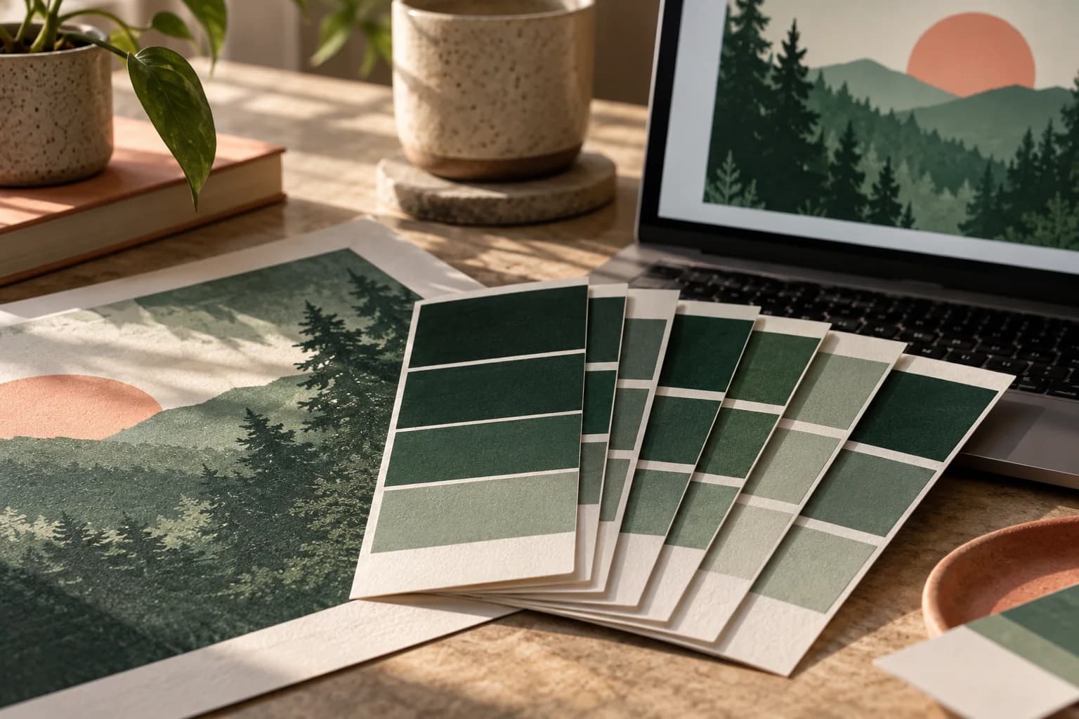
Do not judge a proof beside a bright monitor, because your eyes adapt to the screen. Turn the display brightness down if you must compare, and remember that the finish changes appearance too. The same image looks deeper and more saturated on gloss than on matte, so weigh matte or gloss paper against the room where the poster will hang.
How do you fix a poster that printed too dark?
Work on the original file, not a converted copy. Open up the shadows with a curves or levels adjustment, lighten the midtones slightly, and add separation between dark elements that sit side by side. Avoid relying on a brighter screen to judge the change. Then request another proof on the same paper and compare it with the first under the same light.
If an image is dark by design, protect the details that matter by placing them on lighter areas, and keep text off the deepest shadows.
What should a color approval record?
- The exact file name and version you approved.
- The proof type and the paper it was printed on.
- The light you used to review it.
- The critical colors and how closely they must match.
- Any tolerance or change agreed with the printer.
- The name of the approver and the date.
Voqado's Studio preview and PDF export are RGB and are not calibrated color proofs, so treat them as layout checks. Before ordering a custom poster, run a final poster file preflight and use the notes above when you approve a poster proof.
Frequently asked questions
Why did my poster print darker than my screen?
Your monitor emits bright light, while a printed poster only reflects part of the light in the room, and ink absorbs some of it. Shadows merge and saturated screen colors fall outside what ink can reproduce. Uncalibrated displays are usually set too bright, which makes the gap larger. Lighten shadows and midtones in the original file, then check a new proof on the same paper.
What is a soft proof?
A soft proof is an on screen simulation of how a file will look when printed under a specific print condition. Color management software uses the printer's ICC profile to preview the result on a calibrated display. It is useful for spotting problems early, but it cannot show paper texture, finish or the light in the room, so it does not replace a physical proof for critical color.
Should I convert my poster file to CMYK before printing?
Only if the printer asks for CMYK and tells you which profile to use. Different presses and papers use different profiles, and converting to the wrong one can shift colors before the file even reaches production. Keep your original RGB master, follow the printer's color instructions for the export, and review a proof made from that exact export.
What light should I use to check a color proof?
Use one consistent light every time. Graphic arts viewing booths use a standardized D50 source so that everyone judges color under the same conditions. Without a booth, review proofs in light similar to where the poster will hang, away from a bright monitor, and compare every later sample under that same light so differences come from the print, not the room.
Sources & specification notes
The references below support the relevant technical or product details in this guide. Examples and checklists are not claims of practical testing or universal supplier requirements. Confirm the current specifications for your chosen product before production.
- U.S. Government Publishing Office: GPO Publishing Guidelines ↗
States that a furnished color visual is not a good representation of the final piece, warns that uncalibrated monitors show colors that cannot be printed, and gives proof specifications for color jobs.
- International Color Consortium: Introduction to the ICC profile format ↗
Explains that device profiles convert color between device color spaces and device independent color spaces, and describes the rendering intents, including the one used for proofing.
- International Color Consortium: White Paper 7, The role of ICC profiles in a colour reproduction system ↗
Describes soft proofing, the choice between a colorimetric match and a pleasing reproduction, and the need for a proofing cycle when the receiver adjusts an image.