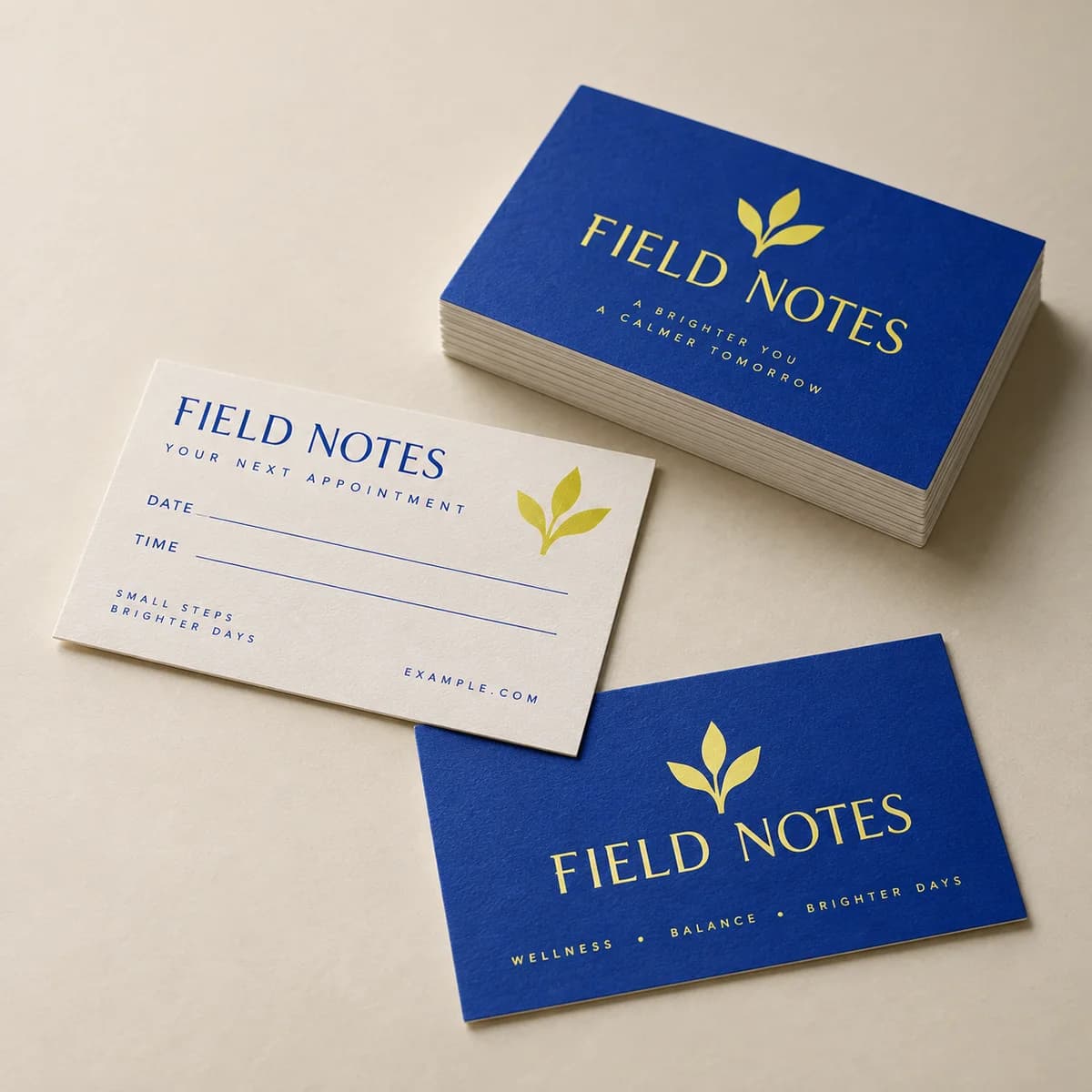
Appointment cards
From $18.99100 items
A useful little reminder, beautifully presented. Appointment cards make sure they come back.
Choose options Start without artwork · Tax and delivery shown before payment.Explore appointment cards, practice letterhead, presentation folders, and patient information rack cards for clinics and dental practices.
Patient facing print has an unusual constraint: it leaves the building. An appointment card ends up on a refrigerator, a rack card goes home in a bag and a folder sits on a kitchen table where other people read it. That makes what you leave off a printed piece as considered as what you put on, and it makes a few of your notices a posting requirement rather than a choice.
A useful little reminder, beautifully presented. Appointment cards make sure they come back.
Choose options Start without artwork · Tax and delivery shown before payment.Double sided with clear space for a date and time on a stock that takes pen, so the next visit is written while the patient is still at the desk.

Loose papers feel like homework. A branded folder feels like a plan.
Choose options Start without artwork · Tax and delivery shown before payment.One or two pockets and a business card slot, so a discharge packet leaves as a single object instead of a loose stack.
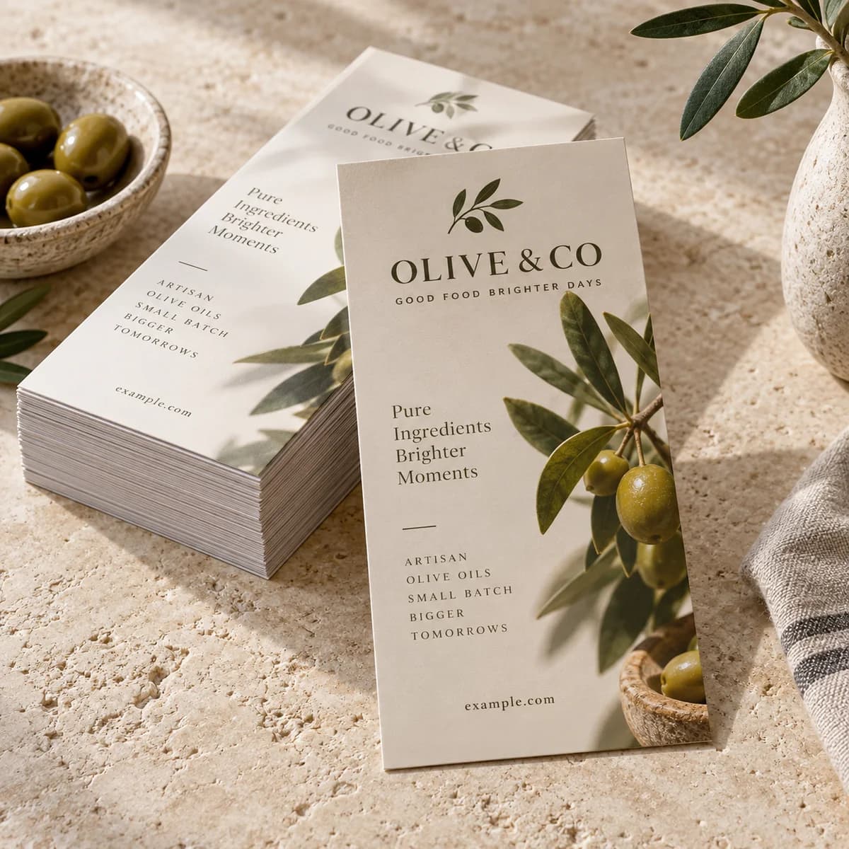
Narrow card, tall order: get noticed on a crowded rack in under three seconds.
Choose options Start without artwork · Tax and delivery shown before payment.Sized at 3.74 by 8.27 inches for a standard lobby rack, with an optional perforated tear off tab for booking details a patient can keep.
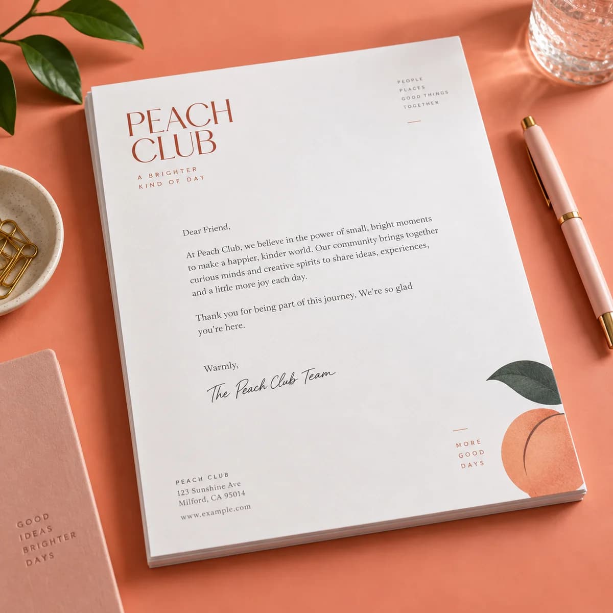
Every page deserves a proper introduction. Custom letterhead puts your logo, name, and contact info up top: clean, consistent, instantly yours.
Choose options Start without artwork · Tax and delivery shown before payment.Standard white runs through your own laser or inkjet printer for referrals and appeals, and white envelopes are included with the order.
A covered health care provider that has a physical service delivery site must do two printed things under 45 CFR 164.520(c)(2)(iii): keep the notice available for anyone who asks to take a copy away, and post it in a clear and prominent location where it is reasonable to expect a person seeking service to be able to read it. That is a wall in the waiting area, not a binder behind the desk, and it is a reason to print the notice at a size someone can read standing up rather than reducing it to fit one sheet. Keep a stack of take away copies in the same room, because the availability half of the rule is the half practices forget.
An appointment card is handed over at a desk, carried through a waiting room and often dropped. The minimum necessary standard in 45 CFR 164.514(d) is about limiting information to what the purpose actually requires, and the purpose of this card is getting somebody to an address at a time. It does not require the procedure name, a record number, a diagnosis or an insurance reference. Practice name, address, phone, date and time is the whole job. If your clinic name itself discloses the specialty, consider whether the card needs the full name or whether initials and an address serve the patient just as well on a piece that travels.
Clinical correspondence is generated on demand and in volume: a referral letter, an insurance appeal, a records release, a work note. All of it is overprinted in the office on preprinted stock, and only the standard white sheet is built to run through a laser or inkjet. That single fact decides the stock for a practice, because the alternative is a beautiful sheet nobody can use on a Tuesday afternoon. Keep the printed header shallow and the footer short, because a referral that runs to a second page gets separated from its first page in a file room. White envelopes are included with a letterhead order, which is worth knowing when you budget a stationery refresh.
Patients leave with paper: post procedure instructions, a consent copy, a medication list, a next visit card. Loose, that stack gets separated in a car and half of it never reaches the fridge. A folder keeps it as one object and gives aftercare instructions a fighting chance of being read. Specify by use rather than appearance: two pockets if you routinely separate clinical instructions from billing and insurance paperwork, so a patient hunting for wound care at ten at night is not sorting through an explanation of benefits, and the business card slot for the coordinator who will take the follow up call. A soft touch surface suits a consultation piece and not a folder handled with gloves on.
Patient facing print should be legible before it is beautiful. Keep type generous, contrast high and the next action obvious. Anything carrying patient details has handling requirements that print alone does not solve, so confirm your privacy obligations before adding names or record numbers to a printed piece.
Build your brand kit →Writing the name on a card you hand to that patient is not the concern. The question the minimum necessary standard in 45 CFR 164.514(d) puts to you is what else is on it. A procedure name, a record number or a treatment code on a card that travels in a coat pocket is more than the purpose requires. Keep the card to the practice details, the date and the time, and confirm your own compliance policy before adding anything clinical to a printed piece.
Under 45 CFR 164.520(c)(2)(iii), a provider with a physical service delivery site must post it in a clear and prominent location where a person seeking service can reasonably be expected to read it, and must also have copies available for anyone who asks to take one. In practice that means a legible printed notice in the waiting area at a size readable while standing, plus a supply of take away copies in the same room rather than only on request at the desk.
What the practice treats, how to book and where to park, in type a patient can read without their glasses. A rack card sits at 3.74 by 8.27 inches in a shared lobby display, which means it competes with every other card in the rack and gets read standing up. Keep it to services and access rather than clinical detail, and use the optional perforated tear off tab for the booking line, so the part a patient keeps is the part that brings them back. Nothing on a public rack should reference an identifiable patient.
Enough to get the patient to the right place at the right time, and no more. The card travels in a coat pocket, onto a refrigerator and sometimes onto a desk at work, so anything clinical on it is disclosed to whoever walks past. Practice name, address, phone, date and time does the whole job. Write the date at the desk rather than printing a run per day, which is why a matte or uncoated stock that takes pen matters more here than a finish that photographs well.
Business cards by industry · 6 MIN READ
Design dentist business cards patients keep: credential lines, specialty wording, an appointment back that takes a pen, and the office cards you need.
Read the guide
Business cards by industry · 6 MIN READ
How to design therapist business cards clients feel safe keeping: license lines, associate disclosures, discreet design, crisis info and the right paper.
Read the guide
Small business print · 6 MIN READ
Letterhead design guide: what to include, where to place it, margins that work with printers and Word, paper choices, and a digital version to match.
Read the guide
Small business print · 5 MIN READ
Plan presentation folders: 9 × 12 in specs, pocket and card slit options, paper and coatings, and what to put inside for sales and onboarding.
Read the guide
Flyers, brochures & booklets · 6 MIN READ
The standard rack card size is 4 × 9 in. Get bleed and safe area specs, the top third rule for display racks, paper choices and a layout that works.
Read the guideHelp us improve Voqado with analytics? Details