Where does a logo go on a business check?
The standard spot is the top left corner, in the payer block with your company name and address. That is where payees look for who wrote the check, and it is the area of the face with the most room to spare. A logo there makes the check look established and helps a supplier match it to your invoices.
Every other zone on a check already has a job. The table shows what each area holds and whether a logo belongs there.
| Area of the check | What it holds | Logo? |
|---|---|---|
| Top left | Company name, address, phone | Yes, the standard spot |
| Top center | Bank name on some layouts | Only if the layout leaves room |
| Top right | Check number, date, fractional routing | No |
| Middle | Payee line, amount box, written amount | No, keep it clear for writing |
| Lower right | Signature lines | No |
| Bottom 5/8 inch | MICR line | Never |
Which areas of a check must stay clear?
The strictest rule is the clear band. The TROY MICR handbook, summarizing ANSI specifications, requires the bottom 5/8 inch of a check to be free of any printing other than the MICR characters, including digitized signatures and artwork. A logo or background that creeps into that band can cause bank reader sorters to misread the line and reject the check.
The written fields need protection too. The date, payee, amount and signature areas must stay light and uncluttered so handwriting or printed data reads cleanly. Our guide to the parts of a check shows where each field sits.
What file format works best for a check logo?
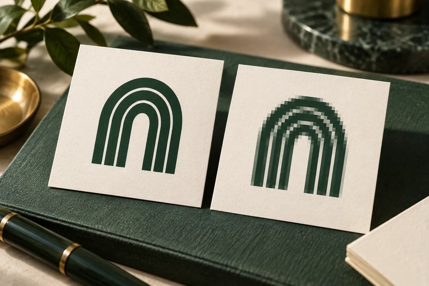
A vector file is best. Vector artwork is made of shapes rather than pixels, and Adobe notes that vectors can be resized without losing quality, which is why logos are usually built that way. Ask your designer for SVG, EPS or a vector PDF.
If you only have a raster image, such as PNG or JPG, it needs enough pixels for the printed size. Raster resolution is measured in pixels per inch, and 300 ppi at the final printed size is a widely used target for sharp print. Screenshots and logos saved from a website are usually far too small.
- Best: SVG, EPS or vector PDF
- Good: PNG at 300 ppi or more at printed size, transparent background
- Risky: JPG with a white box around the logo
- Avoid: screenshots, social media avatars, images copied from a web page
How big should a logo be on a check?
Small. On a wallet check of 6 x 2.75 inches, a logo about 0.5 to 0.75 inch tall sits comfortably beside the company name. On an 8.5 inch wide business check there is room for a little more, but the logo should never crowd the name, which carries the legal weight.
Worked example: a logo printed 0.75 inch tall and 1.5 inches wide needs at least 225 x 450 pixels at 300 ppi. A 120 pixel wide logo from a website header would print at only 80 ppi at that size and look soft. The print resolution calculator does this math for any size.
Should a check logo be one color?
One color logos read best on checks. Check stock often carries a tinted background pattern, and fine detail, gradients or low contrast colors can blur against it. A dark single color version of your logo, in black or your main brand color, holds up at small sizes and prints consistently.
If your logo is complex, ask whether a simplified mark or wordmark version exists for small uses. Many brands keep one for exactly this purpose.
Can a logo be used as a background watermark?
Some businesses want a faint, oversized logo behind the whole check. It can look good, but it carries risk. A background that is too dark competes with handwriting and printed amounts, and the Federal Reserve notes that check images can be rejected for failing image quality standards.
If you want a watermark effect, keep it very light, keep it out of the payee, amount and signature areas, and stop it well above the bottom 5/8 inch. Prefer the printer's security backgrounds, which are designed to stay readable while showing alteration.
What should you check before uploading a logo?
Run your file through the free artwork checker to spot low resolution or color problems, then confirm these points.
- File is vector, or raster at 300 ppi or more at printed size
- Transparent background with no white box
- A one color version is available
- Logo sits in the top left beside the company block
- Nothing touches the payee, amount, signature or date areas
- Nothing reaches the bottom 5/8 inch
- The company name next to the logo matches the account title
For the name line and DBA questions that sit beside the logo, see business checks for an LLC. For the rest of the ordering steps, the check printing guide and the step by step ordering walkthrough cover formats, bank data and proofs.
What if you do not have a vector logo?
Start by asking whoever designed the logo; the original files are often sitting in an email or a shared folder. Sign makers, embroiderers and past print shops usually needed a vector version too, so check old orders. If none exists, a designer can redraw a simple logo as a clean vector, which is a small one time job that pays off on every future print piece.
Avoid automatic tracing tools on a blurry image unless you check the result closely. They often round off corners, merge thin letters and produce shapes that look wrong at small sizes, which is exactly where a check logo lives.
Which check formats can carry a logo?
Most business formats have room for one. Voqado wallet checks let you add your logo to a 6 x 2.75 inch check, single or duplicate, beside your business name and details. Laser and three to a page business checks carry a company block too; check the product options for the layout you choose.
Whatever the format, review the production proof at actual size. If the logo looks crowded or soft on the proof, it will look the same on every check in the box, so fix it before you approve. When the file is ready, add your logo to wallet checks and approve the proof.
Frequently asked questions
Can I put my company logo on business checks?
Yes. Most business check formats let you add a logo in the top left beside your company name and address. Keep it small, keep it out of the payee, amount and signature areas, and never let it reach the bottom 5/8 inch, which is reserved for the magnetic MICR line that banks read.
What resolution does a logo need for printing on checks?
Use a vector file such as SVG, EPS or a vector PDF if you can, because vectors print sharp at any size. For a PNG or JPG, aim for at least 300 pixels per inch at the printed size. A logo printed 0.75 inch tall needs at least 225 pixels of height.
Can a logo in the wrong place cause a check to be rejected?
It can. The bottom 5/8 inch of a check must hold nothing but the MICR characters. Artwork or a background in that band can interfere with the reader sorters that read the line, leading to rejects and manual processing. A very dark background can also hurt check image quality.
Should my check logo be in color?
It can be, but a simple one color version usually reads better. Check paper often has a tinted security background, and gradients or fine detail can blur against it at small sizes. If you print in color, choose a dark brand color with strong contrast, and check the proof at actual size.
Sources & specification notes
The references below support the relevant technical or product details in this guide. Examples and checklists are not claims of practical testing or universal supplier requirements. Confirm the current specifications for your chosen product before production.
- TROY Group: MICR Basics Handbook ↗
Requires the bottom 5/8 inch clear band to be free of any printing other than MICR characters, including digitized signatures and artwork.
- Adobe: Raster vs vector ↗
Explains that vectors scale without quality loss and that raster resolution is measured in pixels per inch.
- Federal Reserve Financial Services: Check 21 enabled services FAQ ↗
Confirms that electronic check records carry the MICR line data and that items can be rejected for image quality.