Why does small embroidered text fill in?
A stitch is a physical thing with a width. Satin stitch, the dense zig zag that forms most lettering, needs enough travel to look solid and enough space between strokes to leave a gap. When a letter is scaled down, the strokes stay roughly the same width while the counters, the enclosed white shapes inside letters, shrink toward nothing.
The result is predictable. First the counters close in e, a, o and s. Then adjacent letters touch. Then the whole word reads as a textured bar. Nothing has gone wrong at the machine; the artwork simply asked for a gap narrower than thread.
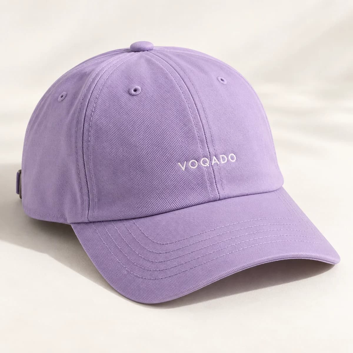
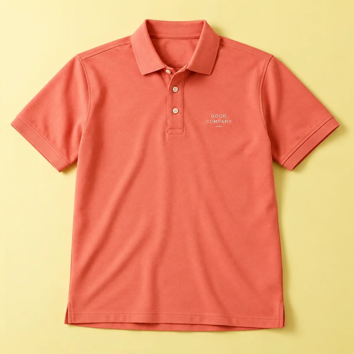
Fabric makes it worse or better. A smooth pique knit polo holds small lettering more cleanly than a heavy fleece hoodie, where the pile pushes up between stitches and swallows detail. Cap fronts sit somewhere in between, helped by backing but limited by the curve of the panel.
What sizes actually work?
| Element | Practical minimum | Comfortable |
|---|---|---|
| Plain sans serif capitals | About 0.25 in | 0.3 to 0.4 in |
| Plain sans serif lower case | About 0.3 in x height | 0.35 in and up |
| Serif or script | About 0.35 in | 0.5 in and up |
| Thin or condensed faces | Avoid at small sizes | Redraw heavier |
| Registered or trademark marks | Often dropped | Set as a separate larger element |
These are guidelines for planning, not a specification for any particular product. The decoration template for your garment is sent before production for products that do not publish one, and the supplier confirms what the actual machine and fabric can hold.
A useful comparison comes from sign legibility. The ADA Standards for visual characters on signs set a minimum of 5/8 in of character height for close viewing, and that is for flat, high contrast printing with no thread involved. Embroidered text at a quarter inch is already asking a lot of the process, which is why so many logos lose their strapline on a cap.
How do you test before you commit?
You can catch almost every problem on paper in five minutes.
- Print the logo at the exact size it will be stitched, in black on white.
- Hold it at arm's length. If a letter is ambiguous on paper, thread will not rescue it.
- Draw over the strokes with a medium tip pen. If neighboring strokes merge, they will merge in thread.
- Check every counter. If the hole inside an e disappears under the pen, that letter will fill.
This test is deliberately crude, because the failure mode is crude. It is the same reason poster designers print one section at full size rather than judging at 25 percent zoom.
What should you do with a logo that is too detailed?
Most logos have three layers of information: the mark, the name, and everything else. Embroidery usually keeps the first two and loses the third.
Start by removing the strapline, the web address, the year of establishment and the registered mark. If the name is still too small, set it on a second line below the mark rather than beside it, which buys height. If the typeface is a thin geometric sans or a light script, substitute a heavier weight of the same family. A slightly bolder logo at stitchable size looks far better than a faithful one that is illegible.
Send vector artwork where you have it. The digitizer redraws your mark as stitch paths, and clean outlines make that redraw faithful. A screenshot of a logo cannot be followed accurately at any size, which is the same problem that makes screenshots weak print artwork.
Does placement change the minimum?
Yes, in practice. A left chest logo on a polo has flat, stable fabric and no obstruction, so it holds the smallest text on the garment. A cap front is curved and backed, and the panel seam limits width. A sleeve is narrow. A bag panel may have a pocket, a seam or a lining behind it that changes how the hoop can be set.
When you are not sure, make the mark smaller in area and larger in stroke. A 2.5 in wide logo with bold lettering will look better on a cap than a 3.5 in logo with fine lettering, even though the second one is technically bigger.
What about numbers and names?
Team names and numbers are usually the easiest embroidery to get right, because they are set large and in a heavy face by convention. A first name across the chest of a polo at 0.4 in cap height reads cleanly and stays legible after years of washing.
The trap is the apostrophe and the accent. Punctuation and diacritics are small by nature and are the first things to blur. If a name needs them, set the whole name larger rather than accepting a smudge above a letter.
Embroidery text checklist
- Aim for at least 0.25 in capital height in a plain sans serif, more for serifs and scripts.
- Print the logo at final size and check every counter with a pen stroke.
- Drop straplines, web addresses and registered marks rather than shrinking them.
- Choose a heavier weight instead of a smaller size.
- Send vector artwork so the digitizer has clean outlines to follow.
- Expect the supplier to confirm what the actual garment and machine can hold.
Frequently asked questions
How small can embroidered lettering be?
As a planning figure, about a quarter of an inch in capital height for a plain sans serif, and around a third of an inch or more for serif and script faces. Thin and condensed typefaces should be redrawn heavier rather than scaled down. The final limit depends on the fabric and the machine, and the supplier confirms it.
Why did my embroidered logo lose its text?
The counters closed. Strokes in embroidery have a minimum practical width, so when a letter is scaled down the enclosed shapes inside e, a, o and s shrink faster than the strokes do, until they disappear. The remedy is a larger setting, a heavier typeface, or removing the smallest line of text entirely.
Does fabric affect the minimum text size?
Yes. Smooth pique knit on a polo holds small lettering best. Fleece and heavy knits push pile up between stitches and swallow fine detail, so they need larger text. Curved surfaces such as cap fronts add their own limit, since the panel shape and seam restrict how wide and how flat the design can sit.
Should I send vector or raster artwork for embroidery?
Vector where you have it. The design is redrawn as stitch paths, and clean outlines make that redraw faithful to your mark. A low resolution raster file, and especially a screenshot, gives the digitizer fuzzy edges to interpret, which shows most in small lettering and thin strokes.
Sources & specification notes
The references below support the relevant technical or product details in this guide. Examples and checklists are not claims of practical testing or universal supplier requirements. Confirm the current specifications for your chosen product before production.
- U.S. Access Board: Guide to the ADA Standards, chapter 7 signs ↗
Used as a legibility benchmark: visual characters need at least 5/8 inch of height for close viewing in flat print, which puts quarter inch embroidered text at the edge of what is readable.
- ASTM D1907/D1907M: Standard Test Method for Linear Density of Yarn (Yarn Number) by the Skein Method ↗
Defines how thread and yarn thickness is measured, which is the physical reason a stitch has a minimum practical width.