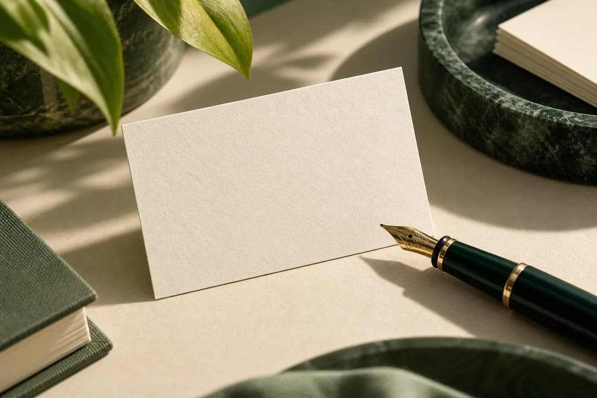
What makes uncoated paper easier to write on?
Coated papers are finished with a thin layer that seals the surface. That layer makes photographs look crisp, but it also gives ballpoint and gel ink very little to grip, so writing can skip, sit wet on top or smear when the card goes into a pocket. Uncoated paper keeps an open, slightly absorbent surface. Ink soaks in, pencil graphite catches on the texture, and most everyday pens leave a clean line.
The tradeoff is that absorbency works on printed ink too. Colors spread a little into the fibers, so solids look more muted and very fine lines soften. For a card that doubles as a note, an appointment reminder or a referral slip, that is usually a good trade.
| Surface | Ballpoint pen | Gel or felt tip | Printed color | Typical use |
|---|---|---|---|---|
| Uncoated | Writes cleanly | Can feather on soft stocks | Softer, muted | Notes, appointments, referrals |
| Matte coated | Usually writes | Needs drying time | Even, low glare | General cards with light writing |
| Gloss coated | Often skips | Smears easily | Bright, saturated | Photo heavy cards, no writing |
| Soft touch laminate | Often skips | Smears easily | Deep, velvety | Premium feel, no writing |
How much writing space does an uncoated card need?
A standard US business card is 3.5 x 2 inches, and once you keep text inside the safe area there is not much room left. Decide what people will write and size the area for that entry, not for neat miniature handwriting. A date, a time with AM or PM and a staff name is a realistic appointment entry. A phone number or a short note is a realistic referral entry.
For reference, college ruled notebook paper spaces its lines 9/32 of an inch apart, which is a sensible minimum for one line of ordinary handwriting. Two or three lines at that spacing, with a short printed label beside each, fit comfortably on the back of a card. If you run printed appointment cards, give the date and time their own lines rather than one shared blank.
Which pens work best on uncoated business cards?
Ballpoint pens and pencils are the safest choices because their ink or graphite sits in the surface without spreading. Gel pens usually work but can take a moment longer to dry. Felt tips and fountain pens are the most likely to feather, where ink bleeds along the paper fibers and blurs the line, especially on thick, soft stocks such as cotton.
Rubber stamps behave differently again. A loyalty stamp needs a surface that takes ink without blotting, and punch card loyalty design covers where to place the marks so they stay readable. Whatever the tool, test the exact pen or stamp that will sit on your counter, at normal pressure, and handle the card a few minutes later the way a customer would.
Will colors look different on uncoated paper?
Yes. Because ink soaks into the paper, colors print a little darker in midtones and less saturated overall than the same file on coated stock. Deep solids can look slightly mottled, and hairline rules or tiny reversed type can fill in. Bold, simple layouts hold up best.
Readability matters more than color accuracy on a writable card. The W3C contrast guidance for screens sets 4.5 to 1 as the minimum ratio for normal text, and while print is not governed by that rule, it is a useful sanity check for pale labels. Light grey type on an ivory uncoated sheet is a common way to make a card look elegant and read poorly.
When should you choose uncoated over matte or gloss?
Choose uncoated when writing is part of the job: appointment cards, referral cards, loyalty cards, gift notes or cards you sign by hand at an event. Choose matte when you want a smoother, more even color with occasional light writing. Choose gloss or a laminate when the card carries photography and nobody needs to write on it. If you are still weighing the coated options, the comparison of matte vs gloss business cards explains how each surface handles color and glare.
How do you test an uncoated stock before you order?
- Write the longest realistic entry with the pen staff will use.
- Wait a few minutes, then rub the writing with a thumb.
- Check for feathering on thick or soft stocks.
- Read the printed labels under the room's normal lighting.
- Stamp it if the card is a loyalty card.
- Put it in a wallet and take it out again.
- Repeat the test after any change of stock or supplier.
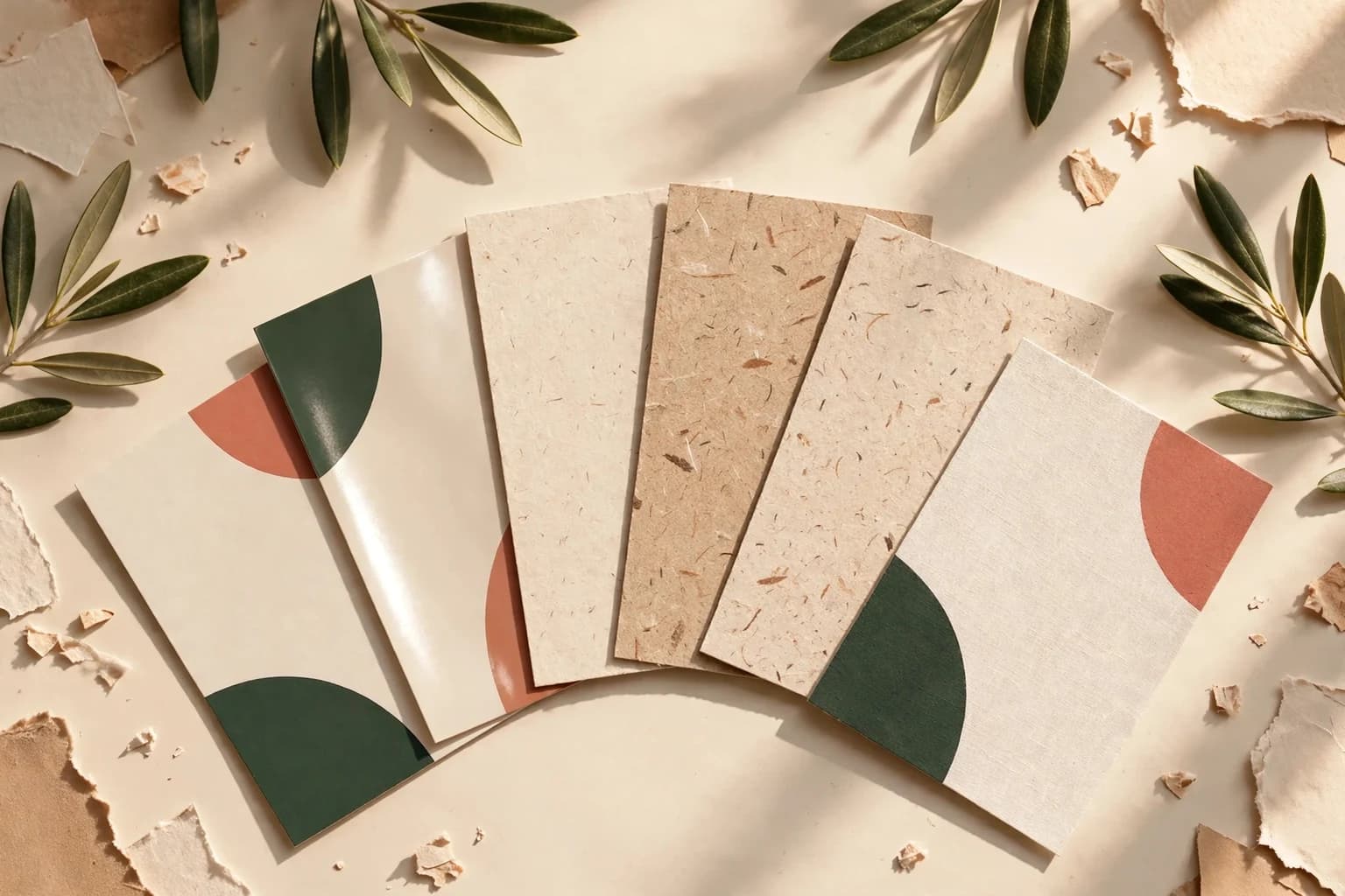
Handling a real card is faster than guessing from a screen, and the business card sample kit lets you compare uncoated paper with textured and premium stocks side by side.
What should the order brief say?
Write down the stock name, whether the card is printed on one or both sides, which side carries the writing area, and the pen you tested. Keep the approved proof with that note. If you plan to describe the card as recycled or eco friendly anywhere, the FTC expects that claim to be specific and supported by evidence, so confirm the paper's actual recycled content before you print it. Voqado lists uncoated cards at 3.5 x 2 inches with front only or double sided printing, and the uncoated card listing shows the current price for 100 cards. For salons and studios that book the next visit at the desk, the salon appointment card layouts show how a writing area fits beside the essential details.
Frequently asked questions
Are uncoated business cards good for writing on?
Yes. Uncoated paper has no sealing coating, so ballpoint pens, gel pens and pencils grip the surface and dry without smearing. It is the usual choice for appointment, referral and loyalty cards. Felt tips and fountain pens can feather on soft, thick stocks, so test the exact pen your staff or customers will use before you order a full run.
Do colors look duller on uncoated business cards?
They look softer. Ink soaks into uncoated paper, so solids are less saturated and midtones print slightly darker than on coated stock. Fine lines and tiny reversed type can fill in. Bold shapes, simple palettes and clear type hold up best. If exact brand color matters, compare a printed sample of your color on uncoated and matte stock before choosing.
What is the difference between uncoated and matte business cards?
Matte cards have a coating with a low sheen, which gives smoother, more even color and less absorbency. Uncoated cards have no coating at all, so they feel more like natural paper and take handwriting more easily. Matte can accept light writing with a ballpoint, but uncoated is the safer choice when writing is part of the card's job.
How much space should I leave for handwriting on a business card?
Size the area for the longest entry people will actually write, such as a date, a time with AM or PM and a staff name. College ruled paper spaces lines 9/32 of an inch apart, a practical minimum for one handwritten line. Two or three labeled lines usually fit on the back of a standard 3.5 x 2 inch card.
Sources & specification notes
The references below support the relevant technical or product details in this guide. Examples and checklists are not claims of practical testing or universal supplier requirements. Confirm the current specifications for your chosen product before production.
- W3C: Understanding WCAG 2.2 Success Criterion 1.4.3 Contrast (Minimum) ↗
Screen contrast ratios of 4.5 to 1 for normal text and 3 to 1 for large text, used here only as a reference point for printed label contrast.
- FTC: Environmental Marketing business guidance ↗
FTC hub for the Green Guides: environmental claims in ads or on products need competent and reliable evidence behind them.