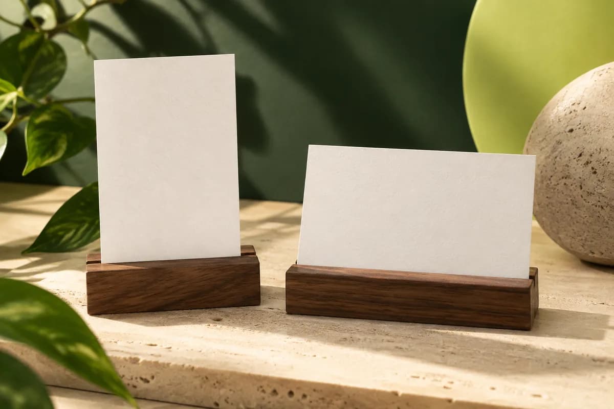
Does a vertical business card cost more or need a different size?
No. A vertical card uses the same sheet, the same cutting and the same stock as a horizontal one, so printers do not normally charge more for portrait orientation. What changes is the file. Set the document up at 2 by 3.5 inches plus bleed, rather than rotating a finished landscape design, and tell the printer which way is up on each side. The business card bleed template shows the full file size with bleed for both orientations.
When does a horizontal layout work better?
Horizontal gives each line of text the full 3.5 inch width. A portrait card offers 2 inches, a line about 43 percent shorter before margins. That difference decides many layouts. Long email addresses, long job titles, a company name set in a wide wordmark and a row of contact details all sit more comfortably in landscape.
Horizontal is also the format people expect. Card holders and desk trays are usually built for landscape, so a horizontal card fits the way most cards are stored and filed.
Landscape also gives more room for a two column layout, with the name and title on one side and contact details on the other. That structure keeps each column short while still using the full width of the card, and it is often the cleanest answer for people with several phone numbers or a long company name.
When does a vertical layout work better?
Portrait suits stacked content: a short name over a title, a tall or square logo, a portrait photograph, or a menu of three or four short services. It also stands out in a pile of landscape cards, which is why photographers, designers, stylists and other creative professionals often choose it. The format rewards short lines, so it works best when the email and website are brief.
A vertical layout also creates a natural reading order from top to bottom. The eye starts at the mark or name and moves down through title, contact details and web address, which suits a centered column. Because the card is narrow, generous space above and below the name matters more than space at the sides. If you have to break the email address across two lines to make it fit, that is a sign the content belongs in landscape instead.
Check the logo first. A wide wordmark shrinks a lot to fit 2 inches, while a tall symbol may crowd a landscape card. The guide to logo placement covers how to scale the mark without distorting it.
How do the two orientations compare?
| Factor | Horizontal, 3.5 x 2 in | Vertical, 2 x 3.5 in |
|---|---|---|
| Line width before margins | 3.5 in | 2 in |
| Suits | Long names, emails, wide wordmarks | Short lines, stacked details, tall logos |
| Card holders and trays | Designed for this orientation | Sits sideways in most holders |
| Photos | Landscape images | Portrait images and headshots |
| Recipient expectation | Familiar | Distinctive |
| Price and stock | Same | Same |
How do card holders, wallets and scanners treat vertical cards?
Wallet slots take either orientation because the card size is identical. Desk holders and display stands are usually landscape, so a vertical card appears sideways there. If your cards sit in a holder on a counter, look at how the portrait version reads from the customer's side before committing. Recipients filing cards in a binder may turn yours sideways.
Can the front and back use different orientations?
Yes. A portrait front with a landscape back, or the reverse, can work well when each side has a different job, such as a name on the front and a map or schedule on the back. Tell the printer the flip direction, because a card turned over along its long edge and one turned along its short edge produce different results. The guide to double sided card orientation explains how to mark the flip in your files.
How do you choose with a side by side comparison?
- Set real copy, not placeholder text, in both orientations.
- Keep the same type size in both versions.
- Check that the longest line fits inside the safe area.
- Print both at actual size on ordinary paper and trim them.
- View them in your holder, wallet and hand at arm's length.
- Choose the version that reads faster, not the one that looks unusual.
If the portrait version forces smaller type to fit the email address, the font size guide explains how far text can shrink before it becomes hard to read.
How do you set up the file correctly?
Start a new document at the finished orientation, add bleed on every side, and keep text inside a safe margin away from the trim. Name the files clearly, for example front portrait and back landscape, and export a print ready PDF. The free business card maker lets you preview your own details on both sides before you build the final file. Once the layout is right, order it as a standard card and upload the portrait artwork, since the card itself is the same 3.5 x 2 inch product.
On the proof, check that the preview shows each side the right way up and that nothing sits closer to the trim than you intended. Portrait layouts often put the name near the top edge, which is exactly where a slight cutting shift is most visible, so give the top margin a little extra room. If you order cards for several people, keep one master portrait template so every name, title and email lands in the same position across the team.
Frequently asked questions
Are vertical business cards unprofessional?
No. A vertical card is simply the standard size turned to portrait, and it is common among photographers, designers, stylists and other creative fields. It looks professional when the layout is designed for portrait, with short lines and clear hierarchy. It looks awkward when a landscape design is just rotated or when long details are squeezed into a 2 inch width.
What size is a vertical business card?
A standard US vertical business card is 2 inches wide by 3.5 inches tall, the same card as a 3.5 by 2 inch horizontal card turned on its side. Add bleed on every side in the design file if color or images run to the edge, and keep important text inside a safe margin away from the trim.
Do vertical business cards cost more?
Usually not. Vertical and horizontal cards use the same stock, size and cutting, so orientation does not normally change the price. Costs come from choices such as paper, finish, shape, sides and quantity. Tell the printer which orientation each side uses, and check the proof to confirm that the front and back read the right way up.
Can a business card be vertical on one side and horizontal on the other?
Yes. Mixed orientation works well when the front and back have different jobs, such as a name on one side and a schedule or map on the other. Tell the printer whether the card flips along its long or short edge, label both files clearly, and review the proof with both sides together before approving.
Sources & specification notes
The references below support the relevant technical or product details in this guide. Examples and checklists are not claims of practical testing or universal supplier requirements. Confirm the current specifications for your chosen product before production.
- W3C: Understanding WCAG 2.2 Success Criterion 1.4.8 Visual Presentation ↗
Line width, line spacing and paragraph spacing guidance for readable text, used here as a reference for short, readable lines.
- W3C: Understanding WCAG 2.2 Success Criterion 1.4.3 Contrast (Minimum) ↗
Contrast ratios for normal and large text, a useful check when a narrow layout pushes type smaller.